Fenwick
Fenwick Outline.otfNote dell'autore
Step back in time with Fenwick, a typeface that breathes new life into the rich typographic traditions of late 19th-century Ontario. This is a bridge between eras, seamlessly blending the robust character of gothic sans-serifs with the refined grace of vintage serif display fonts and the precision of elegant clock numerals.
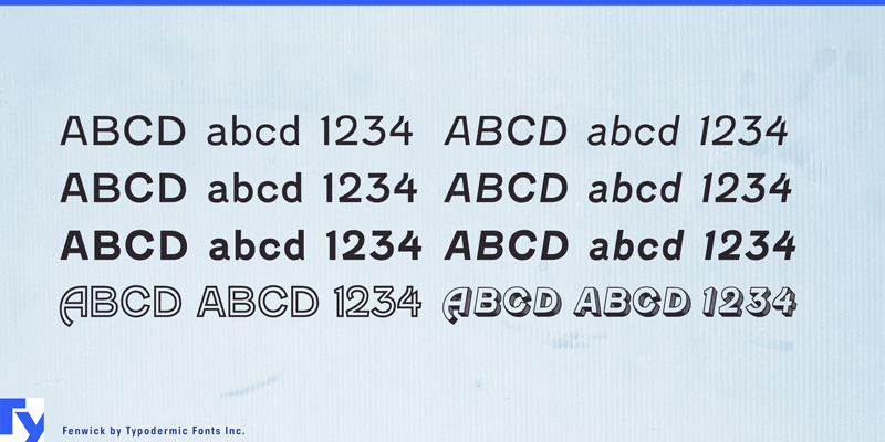
At first glance, Fenwick might evoke memories of time-worn signage on historic Ontario buildings. But look closer, and youll discover a typeface that defies easy categorization. Its subtle nods to serif display fonts and clock digits create a unique personality thats both familiar and fresh, capturing the spirit of innovation that defined Ontarios industrial heyday. Fenwick doesnt just mimic the pastit reimagines it for modern design needs. With seven distinct styles, including Light, Regular, and Bold (each with matching italics), plus an engraved all-caps style, Fenwick offers a full spectrum of design possibilities. From delicate invitations to bold headlines, from body text to display type, this versatile family adapts to any design challenge with period-appropriate flair.
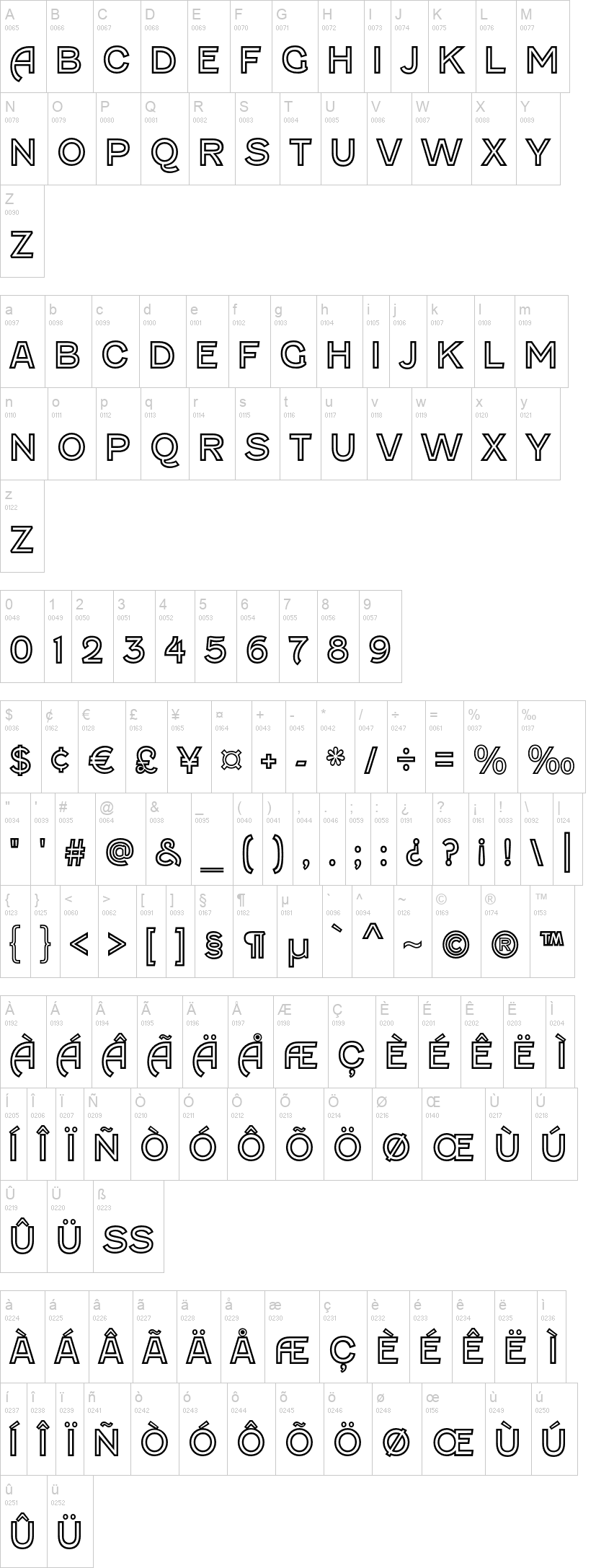
For designers who appreciate the finer details, Fenwicks proportional old-style numeralseasily accessible in OpenType-savvy applicationsadd an extra layer of authenticity to your vintage-inspired creations. Its these thoughtful touches that transform Fenwick from a mere typeface into a storytelling tool, one that speaks volumes about Ontarios rich cultural and industrial heritage. But Fenwicks appeal isnt limited by borders. Supporting a wide range of Latin-based European languages, this typeface is ready to bring its vintage charm to global audiences. Whether youre designing for a local Ontario brewery or an international steampunk convention, Fenwick communicates with clarity and character across linguistic boundaries. Altro...
At first glance, Fenwick might evoke memories of time-worn signage on historic Ontario buildings. But look closer, and youll discover a typeface that defies easy categorization. Its subtle nods to serif display fonts and clock digits create a unique personality thats both familiar and fresh, capturing the spirit of innovation that defined Ontarios industrial heyday. Fenwick doesnt just mimic the pastit reimagines it for modern design needs. With seven distinct styles, including Light, Regular, and Bold (each with matching italics), plus an engraved all-caps style, Fenwick offers a full spectrum of design possibilities. From delicate invitations to bold headlines, from body text to display type, this versatile family adapts to any design challenge with period-appropriate flair.
For designers who appreciate the finer details, Fenwicks proportional old-style numeralseasily accessible in OpenType-savvy applicationsadd an extra layer of authenticity to your vintage-inspired creations. Its these thoughtful touches that transform Fenwick from a mere typeface into a storytelling tool, one that speaks volumes about Ontarios rich cultural and industrial heritage. But Fenwicks appeal isnt limited by borders. Supporting a wide range of Latin-based European languages, this typeface is ready to bring its vintage charm to global audiences. Whether youre designing for a local Ontario brewery or an international steampunk convention, Fenwick communicates with clarity and character across linguistic boundaries. Altro...
Visto per la prima volta su DaFont: 15/07/2010 - Aggiornato: 26/11/2024