

Forum
5 posts
Korean makes this alphabet
I am professional Korean font designer.
I made alphabet included in the Korean font.
But I don't know alphabet in the form of well.
Please inform me if you see some strange letters.
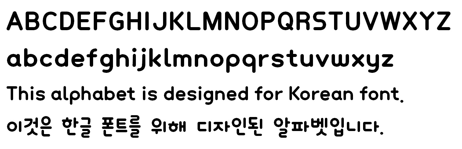
Edited 2 times. Last edit on Jan 16, 2013 at 09:48 by drf_
I made alphabet included in the Korean font.
But I don't know alphabet in the form of well.
Please inform me if you see some strange letters.
Edited 2 times. Last edit on Jan 16, 2013 at 09:48 by drf_
Though I'm not completely sure of what you're requesting, it all looks fine to me, nice font btw
Thank you for your comment.
I'm telling about "detail" that I cannot see.
(Because I have not used the alphabet)
for example:
I think small "s" is little bit wider than other letter.
Light version :

Edited on Jan 17, 2013 at 09:52 by drf_
I'm telling about "detail" that I cannot see.
(Because I have not used the alphabet)
for example:
I think small "s" is little bit wider than other letter.
Light version :
Edited on Jan 17, 2013 at 09:52 by drf_

Smells after Alejandro Paul's Grover Bold. Notice the s.

Mission We said 
I'm telling about "detail" that I cannot see.
(Because I have not used the alphabet)
(Because I have not used the alphabet)
Maybe i would remove the curve at the bottom of the 'a' to match with b, d,...
and i'll move up the period to be on the same line
it's really nice !
All times are CEST. The time is now 10:54
