
Foro
203 posts Fuentes identificadas Sólo solicitudes
Posts de Neoqueto


Fuente identificada: Ultra 911


Fuente identificada: Birth of a Hero


With spacing in-between characters reduced.
Fuente identificada: Helvetica Neue 97 Condensed Black Oblique

You can't find it on DaFont and that's because DaFont actually respects authors' rights, much unlike many other sites that may or may not be known 2U.
Fuente identificada: Amalgama

Modified. (old version)
Editado el 10/05/2014 a las 14:25 por Rodolphe
Fuente identificada: Good Times
Editado el 10/05/2014 a las 14:25 por Rodolphe

Fuente identificada: Junko's Typewriter

Oh, you, Rocamaco!
Editado el 12/04/2013 a las 17:13 por Neoqueto
Fuente sugerida: Berlin Sans (Ya se ha sugerido aquí)
Editado el 12/04/2013 a las 17:13 por Neoqueto

Fuente identificada: Electramaniacal

Yup, this is it. Thanks.

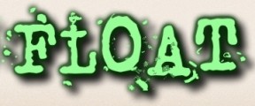
Imagen original: http://i47.tinypic.com/1z2nkt3.png

Fuente identificada: Cubic

I made that font only because of this thread 
And... hi there, Elmoyenique!
Editado el 08/02/2013 a las 22:29 por Neoqueto

And... hi there, Elmoyenique!
Editado el 08/02/2013 a las 22:29 por Neoqueto

Jak ja gościa nienawidzę D:

Fuente identificada: Berate The Elementary
Huso horario CEST. Ahora son las 22:18
