
Forum
13,114 posts Identified fonts Requests only
Posts by Heron2001


probably the cheapest made Commercial Script and then stroke to slightly heavy up.
Suggested font: Commercial Script


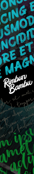
Suggested font: Wood

It's very small -- but it might be Gotham in book weight.
You can test drive it here: https://try.typography.com/?font=100008
You can test drive it here: https://try.typography.com/?font=100008
Suggested font: Gotham

Identified font: Bauhaus


Settle for similar? The N reminds me of one of those hippy dippy fonts from the 1960s.
NOT THE FONT
NOT THE FONT
Suggested font: Justice

I think Nathan has a point there - so if you are looking for something with the same feel...
NOT THE FONT
NOT THE FONT
Suggested font: Grey Magus

I think this may be Neo Sans in Bold Italic - stretched out a bit... and if not, it could be a substitute.
Edited on Aug 21, 2017 at 00:30 by marty666
Identified font: Neo Sans
Edited on Aug 21, 2017 at 00:30 by marty666
I doubt this is a font - the weights of the letters are all over the place and the two Us do not match up in anyway.

Identified font: Thaitillium

Identified font: Bearpaw

I have a feeling this is handwriting - the Os and Ns are not matching up... If you are looking for something similar - take a look at this one.
NOT THE FONT
NOT THE FONT
Suggested font: Eye Catching

PS Bitstream's old version has the "A" and the "R"

The font is Busorama, and the A may have been an alternate A in the old typositor font. Or someone has renewed Busorama with some new letters.
Identified font: Busorama
It's basic. There is a font family and it comes in several weights.
In the case of Gotham Rounded - you can buy it in:
Light, Light Italic, Book, Book Italic, Medium, Medium Italic, Bold and Bold Italic.
The term Weight refers to which one yours is in. Your sample is set in Gotham Round Book - therefore, book weight.
In the case of Gotham Rounded - you can buy it in:
Light, Light Italic, Book, Book Italic, Medium, Medium Italic, Bold and Bold Italic.
The term Weight refers to which one yours is in. Your sample is set in Gotham Round Book - therefore, book weight.

in book weight
You can try it here: https://try.typography.com/?font=100030
You can try it here: https://try.typography.com/?font=100030
Identified font: Gotham Rounded

Identified font: Bodoni Poster Compressed
All times are CEST. The time is now 07:52
