
Forum
13,089 posts Identified fonts Requests only
Posts by Heron2001


Suggested font: Utah
Either the designer made a new font with the Cap M and B - or someone modified them ..but the rest is all Chicago House.
Identified font: Chicago House

Identified font: Beau Sans


Sounds like if you have the old URW program - you could take Charter Black - run it through and give yourself those rounded edges. (Please don't ask me, I no longer have the program.)

I'm not sure about the character in the middle but the rest is all One Stroke Script
Identified font: One Stroke Script


If you look closely, you will notice that none of the repeating letters are identical - that makes a person (like myself) believe this is not a font, but hand-lettered, aka designed logo type!
Identified font: Stencil


I can't say for certain - but I do believe Salted Rim was handwritten and not a font. And Mamaroneck is good old Helvetica! Sorry.
Edited on Jun 16, 2017 at 17:04 by frd
Identified font: Helvetica
Edited on Jun 16, 2017 at 17:04 by frd
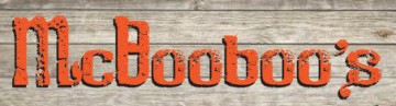
and I believe KINGS was once in an Americana Extra Bold - but your sign is probably hand painted which should account for the inaccuracies.
Suggested font: Americana
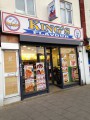
I'm clearly not sure - but FLAVOR looks to me like Aachen that someone stretched out across the sign.
Suggested font: Aachen
You are most welcome - one of my favorites from the 1980s.
Please do this old typographer a favor - use a real apostrophe mark... LOL THANKS!

Edited on Jun 16, 2017 at 16:48 by Heron2001
Please do this old typographer a favor - use a real apostrophe mark... LOL THANKS!

Edited on Jun 16, 2017 at 16:48 by Heron2001

Identified font: Korinna
All times are CEST. The time is now 03:41
