

Fórum
3.821 posts Fontes identificadas
Posts por donshottype


Logo for a Costa Rican beer designed by Enrique Hangen and Wolfgang Hangen at the "Casa Gráfica" advertising agency.
Looks like custom lettering in a simplified textura/blackletter style.
AFAIK no match to a retail font.
For a somewhat similar flavor you could use Pirata One.
Editado em 12/10/2019 ŕs 04:05 por donshottype
Looks like custom lettering in a simplified textura/blackletter style.
AFAIK no match to a retail font.
For a somewhat similar flavor you could use Pirata One.
Fonte sugerida: Pirata One
Editado em 12/10/2019 ŕs 04:05 por donshottype

Libertad ExtraBold Italic is another font with a rough approximation for the _S_ in VISA.
Fonte sugerida: Libertad ExtraBold Italic
Unique lettering with no exact match to a retail font.
See "Brief History of the Visa Card Logo Design"
https://logoblink.com/history-visa-card-logo/
A few fonts have a similar, but not matching, _S_.
For example the _S_ in FF Milo Pro Extra Bold Italic is similar to the top and bottom of the _S_ in VISA, but the diagonal middle is too light.
The diagonal middle in FF Milo Pro Black Italic is closer, but the top and bottom are too heavy.
Fonte sugerida: Milo
Consolas Bold is similar.
Included with Windows and supplied with Microsoft products:
https://docs.microsoft.com/en-us/typography/font-list/consolas
But can also be purchased from Fonts.com, see link, and Linotype.
Editado 3 vezes. Última ediçăo em 08/10/2019 ŕs 10:44 por donshottype
Included with Windows and supplied with Microsoft products:
https://docs.microsoft.com/en-us/typography/font-list/consolas
But can also be purchased from Fonts.com, see link, and Linotype.
Fonte sugerida: Consolas Bold
Editado 3 vezes. Última ediçăo em 08/10/2019 ŕs 10:44 por donshottype


Fonte identificada: Minion
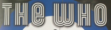
Using lc _e_
Gala Triline is part of a digital revival of Giulio da Milano's Neon, published by the Nebiolo foundry in 1935
Editado em 05/10/2019 ŕs 10:35 por donshottype
Gala Triline is part of a digital revival of Giulio da Milano's Neon, published by the Nebiolo foundry in 1935
Fonte identificada: Gala Triline
Editado em 05/10/2019 ŕs 10:35 por donshottype

Fonte identificada: Goudy Handtooled
Mitchell, suggested by claudeserieux, is the same design as Blair but is slightly heavier.
The capital letters are available as a digital font.
Editado 2 vezes. Última ediçăo em 02/10/2019 ŕs 17:09 por donshottype
The capital letters are available as a digital font.
Fonte sugerida: Mitchell NF
Editado 2 vezes. Última ediçăo em 02/10/2019 ŕs 17:09 por donshottype

Peignot Demi, edited by pasting serifs on upper left hand corner, and with a few minor changes such as clipping the length of the middle stroke on _E_.
Fonte sugerida: Peignot

Fonte identificada: Blackoak

By Monotype 1934, digital version 1990.
Packaged with many Microsoft products:
https://docs.microsoft.com/en-us/typography/font-list/rockwell
Editado em 28/09/2019 ŕs 14:08 por donshottype
Packaged with many Microsoft products:
https://docs.microsoft.com/en-us/typography/font-list/rockwell
Fonte identificada: Rockwell
Editado em 28/09/2019 ŕs 14:08 por donshottype

Don't know how old your image is, but it's Impuls, A brush design by Paul Zimmermann for Wagner in 1954.
Bitstream version released before 2000, RMU pro version [already suggested by 201219994] released in 2010.
Bitstream version released before 2000, RMU pro version [already suggested by 201219994] released in 2010.

These heavy slab-serif letters are probably handlettered or a photo-type creation from the era.
Spade is a modern digital font with some similarity.
Spade is a modern digital font with some similarity.
Fonte sugerida: Spade
Hand lettered, but follows the same general path as _The End_ shown in this video:
https://www.pond5.com/stock-footage/000728494/8mm-film-vintage-end-hd-alpha.html
https://www.pond5.com/stock-footage/000728494/8mm-film-vintage-end-hd-alpha.html
Fonte identificada: Parchment

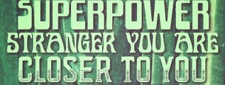
Fonte sugerida: XXII Neue Norm Cnd Black
Todos os horários săo CEST. Agora săo 23:36
