
 English
  Français
  Español
  Deutsch
  Italiano
  Português
Fórum
22 posts Fontes identificadas Apenas pedidos
Posts por lyxdesign


Actually, all of you guys who said it was COMPACTA were wrong. The right font is actually TUNGSTEN.
Fonte sugerida: Tungsten Bold
Would You Please Identify The "UN HOMME, FACE MIROIR" Font (the comma is very important)
Thank you

Thank you

Would You Please Help Me Identify This One

Imagem original: http://www.dafont.com/forum/attach/orig/8/8/88891.gif
Fonte sugerida: Century Gothic

It looks like a stencil font but the resolution is so low so I can't say what exact font is that !
Yep, sorry the Borealis looks just like Mistral, except for the D and the Brush form so I must've mixed up No Worries
No Worries

le M et le D c'est Borealis
Editado 4 vezes. Última edição em 05/01/2012 às 20:45 por Rodolphe
Fonte sugerida: Borealis
Editado 4 vezes. Última edição em 05/01/2012 às 20:45 por Rodolphe
The agic of reams (donc la phrase sans le M et le D) c'est Monotype Corsiva qui est déjà original sur ton Windows
Editado em 05/01/2012 às 20:45 por Rodolphe
Fonte identificada: Monotype Corsiva
Editado em 05/01/2012 às 20:45 por Rodolphe
no problemo bro'
daaams disse 
http://www.dafont.com/forum/read/12474/help-font-of-zend

anyway, zend and studio are 2 different fonts (if fonts)

anyway, zend and studio are 2 different fonts (if fonts)
Agree with you on that, and yes they are fonts, don't remember the names but i'm looking for them on my computer !
I'll be back when I find them !

daaams disse
i'd say it's way too weird (horrible ?) to be a real font
I'm with you on that, it's not a font it's only a vector drawing and you have so many fonts that look like that one
Try this for example
Fonte sugerida: Athletic
Graphicly it's an S, since the bold part doesn't continue with the bottom line, but for the meaning I don't know if they meant Lau and they wrote it that way, that's what I think !
the "!" is customised !
StriKkK disse
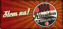
Ce n'est pas de l'impact ni de l'Heldustry 

Hé bein si, pour "minutes" c'est bien impact, la seule police de ce type ou le point du I est rectangulaire et pas carré !
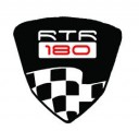
Space Age Font (the ZERO contains a dash (-) in the middle so in the 180 it is replaced by an 'o')
Editado em 04/01/2012 às 12:55 por drf_
Fonte identificada: Space Age
Editado em 04/01/2012 às 12:55 por drf_
Thank you sooo much !
Todos os horários são CEST. Agora são 10:31
