
Fórum
7 posts Fontes identificadas
Posts por misfitrightin

Proxima Nova is closer, and if you're on a Mac you probably have it for free... the M's match better, anyway. Still no apostrophe. But if you're using a graphics program, you could easily remake those glyphs.
Fonte identificada: Proxima Nova
The apostrophe and comma are not correct, but the font would be pretty identical for the text otherwise. Lemme see if I can find something with those punctuation marks for ye.
Fonte sugerida: Nexa Heavy


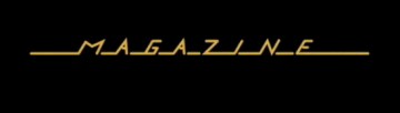
This looks like the now super popular Monthoers.
Editado 2 vezes. Última edição em 17/06/2018 às 09:34 por marty666
Fonte identificada: Swistblnk Monthoers
Editado 2 vezes. Última edição em 17/06/2018 às 09:34 por marty666

The ITALIC version is the closest font I've found that is immediately able to be used without much editing required.
Editado em 13/06/2018 às 19:55 por misfitrightin
Fonte sugerida: Zinger
Editado em 13/06/2018 às 19:55 por misfitrightin
The ITALIC version is the closest version I've found that's use-able without editing.
Editado em 13/06/2018 às 19:56 por misfitrightin
Fonte sugerida: Zinger
Editado em 13/06/2018 às 19:56 por misfitrightin
Todos os horários são CEST. Agora são 21:05
