
Fórum
3.821 posts Fontes identificadas
Posts por donshottype


Fonte identificada: Bremen
Lower half of _S_ reminds me of Billhead 1890. http://www.letterheadfonts.com/fonts/billhead.php The rest of the letters are NOT A MATCH.
Editado em 17/01/2017 às 16:12 por frd
Fonte sugerida: Billhead
Editado em 17/01/2017 às 16:12 por frd


Fonte identificada: Lobster
Grock, as digitized by D.X. Solo


The correct font is Grock, digitized by D.X. Solo and available on a CD sold with the Dover Book of Art Deco Alphabets, but I am not aware of any separate legitimate download.
Editado 2 vezes. Última edição em 16/01/2017 às 14:52 por donshottype
Fonte identificada: Grock
Editado 2 vezes. Última edição em 16/01/2017 às 14:52 por donshottype
Edited:
Apparently a reissue of a 1970s record
I made an error in saying that O'NEAL is Roco by Collis Clements for Letraset in 1973.
The _A_ is sloped on both sides like Grock -- see next post -- rather than a vertical rhs like Roco.
Roco is digitized by Dick Pape based on an image in a D.X. Solo Dover Book as DXSRoco

Dick Pape's fonts are hosted by Luc Devroye
http://luc.devroye.org/fonts-52980.html
and
http://luc.devroye.org/pape/DXS-Art%20Deco%20Display%20(alphabets)/
Editado 3 vezes. Última edição em 16/01/2017 às 18:54 por donshottype
Apparently a reissue of a 1970s record
I made an error in saying that O'NEAL is Roco by Collis Clements for Letraset in 1973.
The _A_ is sloped on both sides like Grock -- see next post -- rather than a vertical rhs like Roco.
Roco is digitized by Dick Pape based on an image in a D.X. Solo Dover Book as DXSRoco
Dick Pape's fonts are hosted by Luc Devroye
http://luc.devroye.org/fonts-52980.html
and
http://luc.devroye.org/pape/DXS-Art%20Deco%20Display%20(alphabets)/
Fonte sugerida: Roco
Editado 3 vezes. Última edição em 16/01/2017 às 18:54 por donshottype
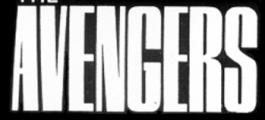
Width is closer to your version but still some noticiable differences such as the bottom pointing serif on _G_
Fonte sugerida: Original Avengers
Rian Hughes says that his Steed Heavy Condensed was inspired by the Avengers TV show.
Not as condensed as the version in your image and some noticiable differences such as the bottom pointing serif on _G_ and the thickness of the diagonal on the _S_.
Not as condensed as the version in your image and some noticiable differences such as the bottom pointing serif on _G_ and the thickness of the diagonal on the _S_.
Fonte sugerida: Steed Heavy Condensed

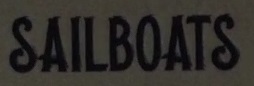
The script looks like 1950s era signage lettering.
I did not find an exact match in a digital font but Sauber Script could be used as an approximate substitute.
I did not find an exact match in a digital font but Sauber Script could be used as an approximate substitute.
Fonte sugerida: Sauber Script


Fonte identificada: Impact Bold


Fonte identificada: Zapf Chancery Italic

Modified version of Edel Grotesque Bold Condensed, originally issued by Wagner & Schmidt aropund 1914 as Wotan Bold Condensed, later also known as Lessing and Reichgrotesk. Don't know if this version of the tail on _Q_ in the title existed in one of the other versions of Edel Grotesque Bold Condensed. The _S_, _R_ and _Q_ in the title are slightlyly more boxy than the digital Edel Grotesque Bold Condensed. Bitstream version of Edel Grotesque Bold Condensed, called Aurora Condensed http://myfonts.us/td-iIIDyl is not as close and has a straight leg on the _R_
Fonte sugerida: Wagner Grotesk

Here is a higher resolution image:

Editado em 07/01/2017 às 09:45 por donshottype
Fonte identificada: Germanica
Editado em 07/01/2017 às 09:45 por donshottype
I suspect that you found a match. Note that the first _t_ is unmodified.

Fonte identificada: Komika Boogie

Davison Spencerian, NOT THE FONT, is a workable substitute for _aison_. The connection between _o_ and _n_ is almost a match. The only really noticeable difference is in the _s_.
Fonte sugerida: Davison Spencerian
Fonte identificada: Engravers Gothic
Todos os horários são CEST. Agora são 04:50
