
Fórum
13.711 posts Fontes identificadas
Posts por koeiekat


Hand lettered. Not a font.
hmmm ... the no brain added a smilie ...
Hi Vinz, my response was not in contra of your post. Not at all. I just felt I needed to elaborate on my first answer. Tophy's post crossed mine as something that took some time happened while I was writing. 

Vinz, I tried to react friendly to sammysalami's ultimate stupidity but have to admit that is was difficult. Let me explain:
The photo is the President of Chile showing a message from the 33 miners locked-in at 700 meters deep in that mine in Chile. Now the ultimate nitwit sammysalami dares to ask which font these miners at 700 meters deep used on their also 700 meters deep computer with infinite battery life and their also 700 meters deep color printer that needs no power outlet to print this message.
How stupid can it possibly get to beat this sort of thinking? Nah, thinking, it is clear that sammysalami has given proof that sammysalami is incapable of thinking.
What do you think sammysalami? It is on a piece of paper, thus it is a font?
Thanks drose, but no match for your sample.
Embroidery 'fonts' are often heavily modified, sometimes even a mix of fonts, to meet the CAM machine possibilities.
Embroidery 'fonts' are often heavily modified, sometimes even a mix of fonts, to meet the CAM machine possibilities.
A naming problem. When the unique font identifiers are different you won't have this problem. Change those.
Ambassador Script (and a bit less Freebooter Script) have an ampersand like that.
Editado em 27/09/2010 às 22:46 por koeiekat
Editado em 27/09/2010 às 22:46 por koeiekat
@tophy
The Kat has great objections to linking to urbanfonts. Please don't. Mailme for explanation.
The Kat has great objections to linking to urbanfonts. Please don't. Mailme for explanation.
Not a font. A logo. There are fonts around that give the same feeling and maybe the logo was even based on one but none the same. Remember, the Ford Sierra logo is from ± 1982, A bit before digital type became common - if at all common then ...
Yeah, embroidery is never the real thing but I first want to know which one of the two ...
Of course it is a good close one. The face in your pict is based on it. Would I otherwise have suggested it? And no, it is not free. But then you didn't ask for a freebee did you? If you are trying to get a thingie as this as a freebee, stop searching. It aint around.

Fonte sugerida: Swung Note
Still was a brilliant answer 

Which one of the two?
I may be wrong but I'm afraid you just made yourself very popular over here.
A simple sorry would have done but nada. I'm out.
mumble, mumble, themes bitmap.
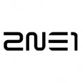
The 2 is the N 90° anticlock. The E and 1 slight modifications.
Edit kk
On second thought, the 2 is made by taking the top right, flipping it and copying it over the bottom left.
These three small modifications done and you have a perfect match for your logo. Takes 2 minutes.

Editado 3 vezes. Última edição em 26/09/2010 às 23:13 por koeiekat
Edit kk
On second thought, the 2 is made by taking the top right, flipping it and copying it over the bottom left.
These three small modifications done and you have a perfect match for your logo. Takes 2 minutes.
Fonte identificada: Westway Westbound
Editado 3 vezes. Última edição em 26/09/2010 às 23:13 por koeiekat
Todos os horários são CEST. Agora são 19:53
