
Fórum
13.711 posts Fontes identificadas
Posts por koeiekat

better ...
Using a non-standard font for a sig only makes that visible in that non-standard font if the viewer happens to have that non-standard font installed.
¿Counterfeiting? ... just wondering ...
Nice find. Very close.
Looked at that one too, but not wide enough and the S doesn't match. Alas.
I am with deds, the Futura Book is slightly too fat.
As said, done with the Duo-line. 10 minutes.
For show, with the Duo-line

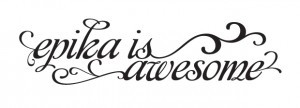
Hand lettered means that this lettering has been done by hand. One can see this by comparing repeating letters, in this case the u and the s.
Hand lettered. See u, u and s, s.
For show.
Edit kk
Thanks Rodolphe.
Editado 2 vezes. Última edição em 02/10/2010 às 11:07 por koeiekat
Edit kk
Thanks Rodolphe.
Editado 2 vezes. Última edição em 02/10/2010 às 11:07 por koeiekat
If the briefing is good and clear, which is a lot more than 'we need a logo', and the proposal does not meet the briefing then indeed it is back to the drawing board. Even when the proposal meets the briefing it is not uncommon that two or three fine-tuning steps have to be done.
Yet, as Vinz said, it is not just shaking a few letters out of the can and done. You want something that represents you, your band, right?
Edit kk:
I have no idea who you are, I can't hear you, I can't see you. I don't know what you do and why you do exactly that. And ... what the logo should communicate » to whom.
Not knowing a thing how could I, or anyone else, possibly make you a logo?
Editado em 01/10/2010 às 17:26 por koeiekat
Kidding requires a functioning brain.
Show me another KS or ks combination that matches, with or without modification ...
Under a 100, count me out.
What is your budget?
Champions Bold maybe? Anyway, a Myriad Semibold modification.
Editado 2 vezes. Última edição em 30/09/2010 às 18:49 por koeiekat
Editado 2 vezes. Última edição em 30/09/2010 às 18:49 por koeiekat

You mean Armor Piercing?
Editado em 30/09/2010 às 11:12 por Rodolphe
Fonte identificada: Armor Piercing
Editado em 30/09/2010 às 11:12 por Rodolphe
Fonte identificada: Affair
Todos os horários são CEST. Agora são 18:15
