
Fórum
3.821 posts Fontes identificadas
Posts por donshottype


With enlarged _m_ at start
Shelly Script is almost identical, but has minor differences, such as a stubbier leading connector for _o_
Editado 2 vezes. Última edição em 15/05/2017 às 16:04 por donshottype
Shelly Script is almost identical, but has minor differences, such as a stubbier leading connector for _o_
Fonte identificada: English 111
Editado 2 vezes. Última edição em 15/05/2017 às 16:04 por donshottype

Good find.
I agree that the letters started out as one of the Briem Akademi fonts, but they are essentially monotone/monoline, while letters in the image are in the thick and thin style, with a squashed curve on the horizontal strokes.
I attempted to reproduce the letters by tinkering with the Briem Akademi fonts. My best result so far is Briem Akademi Semibold Cond, with height compressed to 75 percent.

It might be possible to get closer starting with a different compressed or condensed Briem Akademi font and applying a different height compression.
I agree that the letters started out as one of the Briem Akademi fonts, but they are essentially monotone/monoline, while letters in the image are in the thick and thin style, with a squashed curve on the horizontal strokes.
I attempted to reproduce the letters by tinkering with the Briem Akademi fonts. My best result so far is Briem Akademi Semibold Cond, with height compressed to 75 percent.
It might be possible to get closer starting with a different compressed or condensed Briem Akademi font and applying a different height compression.

Is this produced by a major company? It might be a privately owned font.
Do you have a company name or any other information on the lettering?
The closest retail font found so far is Contax Pro 75 Bold
When the letters are thickened by a parallel stroke most of them look almost identical to the ones in the image:

But differences in several, including _t_ and _r_.
Do you have a company name or any other information on the lettering?
The closest retail font found so far is Contax Pro 75 Bold
When the letters are thickened by a parallel stroke most of them look almost identical to the ones in the image:
But differences in several, including _t_ and _r_.
Fonte sugerida: Contax Pro 75 Bold

Califunkia, but note that THIS IS NOT THE FONT.
Other fonts in this vein include Baileywick Curly, P22 Festiva, Fantini, Scary Scrimshaw NF, Elephant Bells, ITC Ziggy, and Periwinkle Fancy.
Other fonts in this vein include Baileywick Curly, P22 Festiva, Fantini, Scary Scrimshaw NF, Elephant Bells, ITC Ziggy, and Periwinkle Fancy.
Fonte sugerida: Califunkia
If you have Microsoft Office 2007 or later, you have access to a font with this style, called Ravie, but note that THIS IS NOT THE FONT.
Fonte sugerida: Ravie
Psychedelic style of lettering too complex for a font, even with ligatures.
Some of the flavor of the style is shown in fonts like Espresso, but note that THIS IS NOT THE FONT.
Editado em 15/05/2017 às 11:12 por donshottype
Some of the flavor of the style is shown in fonts like Espresso, but note that THIS IS NOT THE FONT.
Fonte sugerida: Espresso
Editado em 15/05/2017 às 11:12 por donshottype
Updated:
Deleted speculation on how the designer might have made the letters.
Editado em 14/05/2017 às 19:36 por donshottype
Deleted speculation on how the designer might have made the letters.
Editado em 14/05/2017 às 19:36 por donshottype

Seems to be custom lettering for the Johnny Cupcakes clothing company.
The word _CUPCAKES_ has a heavy weight and an aspect ratio of height to width of about 5 to 1.
There are very few fonts in this category. Most are wider and a few are taller.
Closest might be Dimensions 300 -- NOT THE FONT -- which is slightly wider and has rounded instead of sharp corners.
For a _K_ with the curved arms you need to look at a wider font like Aurora aka Wagner Grotesk.
Fonte sugerida: Dimensions 300
Agree the numbers could have been created by editing Myriad, but the black fill seems to have been derived from the Regular weight rather than the SemiBold
After some editing to eliminate ink traps etc. and applying two parallel lines, one can obtain the following result by editing Myriad Regular, which would work as a close substitute for the numbers in the image:

After some editing to eliminate ink traps etc. and applying two parallel lines, one can obtain the following result by editing Myriad Regular, which would work as a close substitute for the numbers in the image:
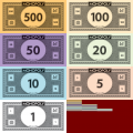
Not convinced that the numbers are taken directly from a font, but still looking.
Closest I found was Serenity Medium.
Closest I found was Serenity Medium.
Fonte sugerida: Serenity Medium

Fonte identificada: Brody


Harrington is supplied with Microsoft products per the link.
https://www.microsoft.com/typography/fonts/font.aspx?FMID=985
Editado em 10/05/2017 às 18:50 por donshottype
https://www.microsoft.com/typography/fonts/font.aspx?FMID=985
Editado em 10/05/2017 às 18:50 por donshottype

Some horizontal stretching
The swash _g_
https://www.myfonts.com/fonts/fenotype/taiga/italic/glyphs.html#glyphs/562761/172
The gapped _a_
https://www.myfonts.com/fonts/fenotype/taiga/italic/glyphs.html#glyphs/562761/160
The swash _g_
https://www.myfonts.com/fonts/fenotype/taiga/italic/glyphs.html#glyphs/562761/172
The gapped _a_
https://www.myfonts.com/fonts/fenotype/taiga/italic/glyphs.html#glyphs/562761/160
Fonte identificada: Taiga Italic

Width may be stretched a little
Editado em 09/05/2017 às 10:16 por donshottype
Fonte identificada: License Plate USA
Editado em 09/05/2017 às 10:16 por donshottype


Frederic W. Goudy used variations of this _N_ for various fonts, most of which are not available in digital form. His Record Title of 1927 is perhaps the closest of his digitized fonts to your image. Also his Goudy Old Style.
Fonte sugerida: Record Title
Todos os horários são CEST. Agora são 16:06
