Fórum
14.955 posts Fontes identificadas
Posts por marty666
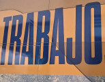
First and last A are the same. Second one has a slightly different top.
The Biggest X seems homemade, with its top left weird angles.
Wait and see if anyone has any ideas.
The Biggest X seems homemade, with its top left weird angles.
Wait and see if anyone has any ideas.
3 different "e"
3 different "t"
3 different "o"
2 different "l"
i might be wrong, but i'd say it's not a font.
3 different "t"
3 different "o"
2 different "l"
i might be wrong, but i'd say it's not a font.
Fonte identificada: Fredoka
Fonte identificada: Typo Slab Irregular
Fonte identificada: Blantic
Fonte identificada: Amsterdam
Fonte identificada: Gingerline
🥳 Herzlichen Glückwunsch! 🥳
Editado 2 vezes. Última edição em 13/02/2024 às 11:34 por marty666
Editado 2 vezes. Última edição em 13/02/2024 às 11:34 por marty666
nice! 
i'm definitely bad at identifying elongated Sans haha

i'm definitely bad at identifying elongated Sans haha
perfect, thanks! 👌
Nice catch.
This is a proprietary font.
If OP wants something similar, Prime Video Sharp is a customized version of Sharp Grotesk. https://sharptype.co/typefaces/sharp-grotesk-global/sharp-grotesk/
Fonte identificada: Impact
I can't find where that E is from 

Fonte identificada: Arial
Fonte identificada: Bank Gothic
Fonte identificada: Eras
Maybe you'll find it in one of the 5 pages of this nice website dedicated to these 2010s experimental sans fonts:
"I Am So Tired Of Your Experimental Sans" https://experimentalsans.tumblr.com
"I Am So Tired Of Your Experimental Sans" https://experimentalsans.tumblr.com
Microsoft JhengHei is intended to be used in Traditional Chinese language environments.
Microsoft Segoe UI is very close (if you don't count the serifs on the uppercase "i")
https://learn.microsoft.com/typography/font-list/segoe-ui
Microsoft Segoe UI is very close (if you don't count the serifs on the uppercase "i")
https://learn.microsoft.com/typography/font-list/segoe-ui
Todos os horários são CEST. Agora são 03:34


