
Fórum
3.821 posts Fontes identificadas
Posts por donshottype


Fonte identificada: Hobo
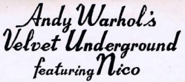
Fonte identificada: Brush Script

Several independently created versions of ITC Neon were published, mostly in the 1990s. All are of rather poor quality.
* Neon Caps WSI
* Diner Computer Support Group 1996
* Neptune Font Bank
* Multistrokes Manfred Klein, adds a shadow effect.
No legitimate download found for Neon Caps, Diner or Neptune.
Multistrokes is available here at Dafont
* Neon Caps WSI
* Diner Computer Support Group 1996
* Neptune Font Bank
* Multistrokes Manfred Klein, adds a shadow effect.
No legitimate download found for Neon Caps, Diner or Neptune.
Multistrokes is available here at Dafont
Fonte sugerida: Multistrokes

The ampersand:
http://www.myfonts.com/fonts/emigre/council/council/glyphs/564178/30
http://www.myfonts.com/fonts/emigre/council/council/glyphs/564178/30
Fonte identificada: Council
Custom for a tote bag using a four line maze design.
Published in 1970.
More info:
https://fontsinuse.com/typefaces/7788/itc-neon
The letters look like a modified ITC Neon

ITC Neon was a phototype era font.
Several fonts use a three line maze design, including Eclectic Crumpany NF.
Ico uses a four line maze design, but it IS NOT THE FONT used to make the letters.
Available from CreativeMarket
Editado 7 vezes. Última edição em 07/03/2018 às 15:09 por donshottype
Published in 1970.
More info:
https://fontsinuse.com/typefaces/7788/itc-neon
The letters look like a modified ITC Neon
ITC Neon was a phototype era font.
Several fonts use a three line maze design, including Eclectic Crumpany NF.
Ico uses a four line maze design, but it IS NOT THE FONT used to make the letters.
Available from CreativeMarket
Fonte sugerida: Ico
Editado 7 vezes. Última edição em 07/03/2018 às 15:09 por donshottype
The capitals are custom -- I love the effective, crisply flowing tail on _Q_. It would also work well on the _K_.
I agree with WicCaesar that the Capitals are probably derived from Kingthings Spike
Editado em 04/03/2018 às 12:29 por donshottype
I agree with WicCaesar that the Capitals are probably derived from Kingthings Spike
Editado em 04/03/2018 às 12:29 por donshottype
Width squeezed by user.

Custom logo for Sapienza Università di Roma [2007?].
Second line in higher resolution, from eps of the logo:

Don't know if Sapienza created a font but the lettering is a modern semi/demi serif, perhaps inspired at least in part by inscriptional lettering by Vatican scribe Luca Horfei in the 16th century, which is the basis for a digital font, Pontif LP. However this IS NOT THE FONT used to make the letters in the logo.
Editado 2 vezes. Última edição em 03/03/2018 às 00:38 por donshottype
Second line in higher resolution, from eps of the logo:
Don't know if Sapienza created a font but the lettering is a modern semi/demi serif, perhaps inspired at least in part by inscriptional lettering by Vatican scribe Luca Horfei in the 16th century, which is the basis for a digital font, Pontif LP. However this IS NOT THE FONT used to make the letters in the logo.
Fonte sugerida: Pontif
Editado 2 vezes. Última edição em 03/03/2018 às 00:38 por donshottype

Source Serif Pro Black

Source Serif Pro is a set of OpenType fonts to complement the Source Sans Pro family. In addition to functional OpenType fonts, this open source repository provides all of the source files that were used to build them using the Adobe Font Development Kit for OpenType (AFDKO).
Source files available from
https://github.com/adobe-fonts/source-serif-pro
Editado 3 vezes. Última edição em 02/03/2018 às 00:44 por donshottype
Source Serif Pro is a set of OpenType fonts to complement the Source Sans Pro family. In addition to functional OpenType fonts, this open source repository provides all of the source files that were used to build them using the Adobe Font Development Kit for OpenType (AFDKO).
Source files available from
https://github.com/adobe-fonts/source-serif-pro
Fonte identificada: Source Serif
Editado 3 vezes. Última edição em 02/03/2018 às 00:44 por donshottype


Captain Howdy with highlight removed by sign maker who also added swash to _G_ and _B_
Like this. Except for the added swash.

Like this. Except for the added swash.
Fonte identificada: Captain Howdy

Yet another interlock font.
More at:
http://www.myfonts.com/search/interlock/
Editado em 28/02/2018 às 22:45 por donshottype
More at:
http://www.myfonts.com/search/interlock/
Fonte sugerida: Manihot
Editado em 28/02/2018 às 22:45 por donshottype
This was hand lettered in a style we now call interlock that was pioneered by Ed Benguiat.
There are several digital interlock fonts, which rely on ligatures for combinations such as _IJ_, _TO_, _LE_ AND _RO_ but none seems to be an exact match to the movie title.
You might like Ed Interlock as a substitute.
There are several digital interlock fonts, which rely on ligatures for combinations such as _IJ_, _TO_, _LE_ AND _RO_ but none seems to be an exact match to the movie title.
You might like Ed Interlock as a substitute.
Fonte sugerida: Ed Interlock
Handlettered version of predigital Coronet by Robert Hunter Middleton, Ludlow in 1937.
Fonte sugerida: Coronet
Previous discussion
https://www.dafont.com/forum/read/352532/saban-s-power-rangers-new-logo-font
https://www.dafont.com/forum/read/352532/saban-s-power-rangers-new-logo-font

Lettering in this style was used long before digital fonts. Jackson MN is similar but is NOT THE FONT.
Editado em 27/02/2018 às 16:25 por donshottype
Fonte sugerida: Jackson
Editado em 27/02/2018 às 16:25 por donshottype
Lettering in this style was used long before digital fonts. Cabezza Grossa is similar but is NOT THE FONT.
Editado 2 vezes. Última edição em 27/02/2018 às 16:25 por donshottype
Fonte sugerida: Cabeza Grossa
Editado 2 vezes. Última edição em 27/02/2018 às 16:25 por donshottype
Todos os horários são CEST. Agora são 09:29
