
Fórum
4.435 posts Fontes identificadas Apenas pedidos
Posts por pilaster

I Agree, 'N' is a modified 'H' IMHO


Some more rooting found this
LTC Kennerley Bold Pro
Uppercase and Smallcaps?
Editado em 30/04/2012 às 12:31 por pilaster
LTC Kennerley Bold Pro
Uppercase and Smallcaps?
Fonte identificada: LTC Kennerley Bold Pro
Editado em 30/04/2012 às 12:31 por pilaster
Plenty of similar here:
http://myfonts.us/td-cav1n8
http://myfonts.us/td-cav1n8


Fonte sugerida: Lubalin Graph Bold
Editado em 30/04/2012 às 09:32 por drf_
I think its a mash up of Lubalin Graph and Avant Garde/alternates...but heavily modified. (Lubalin is a Slab Serif Version of Avant Garde)
Fonte sugerida: Avant Garde Gothic + Alternates

Neoqueto. Don't apologise. We're here to identify the font...  which you have done.
 which you have done.
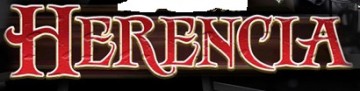
LHF Antique shop modified (lower case)
Editado em 30/04/2012 às 02:16 por rocamaco
Fonte identificada: LHF Antique Shop
Editado em 30/04/2012 às 02:16 por rocamaco
It's our collective pleasure... 


Poiret One from Google Web fonts? The 'P' looks too wide, but it's pretty close....
Fonte sugerida: Poiret One

Looks like Franklin Gothic flavours to me...
Heavy for BASS?
Comp Demi for HEAD?
Heavy for BASS?
Comp Demi for HEAD?
Fonte sugerida: Franklin Gothic
'm' and 'a' modified.
It's possible, but think of the complexity. Each character would need a glyph to 'cut out/overlap' each and every glyph in the font...
IMHO Probably a stroke applied to the Characters and then the cutout/overlap achieved by where the letters fall in layers. So;
in Ol' DIRTY 'R' and 'Y' have an outside stroke and sit above 'T'. Letters are tracked/kerned in tight for the overlap.
IMHO Probably a stroke applied to the Characters and then the cutout/overlap achieved by where the letters fall in layers. So;
in Ol' DIRTY 'R' and 'Y' have an outside stroke and sit above 'T'. Letters are tracked/kerned in tight for the overlap.


Todos os horários são CEST. Agora são 21:42
