
Fórum
3.821 posts Fontes identificadas
Posts por donshottype


Lettering in a Tuscan mustache style.
Some fonts could be edited to make a match.
Don
Some fonts could be edited to make a match.
Don
Fonte sugerida: Buckhorn

Looks like Monotype Corsiva edited to slant it from a sloped to an upright position.
Don
Don
Fonte sugerida: Monotype Corsiva
Seems to me that this is one of the photolettering era fonts that were probably not digitized. Could be Photolettering Inc., Letraset or ??? Might be an amateur digital from the 1990s...
Don
Don
Edited:
More letters http://upload.wikimedia.org/wikipedia/en/d/d8/The_Swords_of_Lankhmar.jpg
Also
http://thetrashcollector.com/PaperbacksMZ/BookSwordsAgainstWizardry.jpg
https://s-media-cache-ak0.pinimg.com/236x/2a/f8/0e/2af80ecda0995afda701fb21f264cc67.jpg
Don
Editado 3 vezes. Última edição em 13/06/2015 às 03:12 por donshottype

I recall those books and loved the Art Nouveau titling.
But when I checked this title against my Petzendorfer Treasury of Art Nouveau Alphabets I drew a blank
All I have to offer is a font with similar flavor
Don
Editado em 13/06/2015 às 02:57 por donshottype
But when I checked this title against my Petzendorfer Treasury of Art Nouveau Alphabets I drew a blank

All I have to offer is a font with similar flavor
Don
Fonte sugerida: Eckmann
Editado em 13/06/2015 às 02:57 por donshottype

Probably custom, but almost indistinguishable from Helvetica Bold, particularly if you thicken the vertical stroke on _$_.
Don
Don
Fonte sugerida: Helvetica Bold
Logo for a German mustard https://www.flickr.com/photos/banger1977/3881185948
Not necessarily a specific font.
Don
Not necessarily a specific font.
Don
Here is a lead. This looks similar to a font used by Pottery Barn for monograms. http://www.myfonts.com/WhatTheFont/forum/case/542990/
Don
Don

Spring Creek Plain by GarageFonts is somewhat similar http://www.garagefonts.com/index.php/fonts/overview/GF090002X1
Don
Editado 2 vezes. Última edição em 12/06/2015 às 11:04 por drf
Don
Fonte sugerida: Spring Creek
Editado 2 vezes. Última edição em 12/06/2015 às 11:04 por drf
The monogram letters are loosely based on 19th century Tuscan twig designs similar to the one digitized by Spiece Graphics as Astoria Antique http://www.myfonts.com/fonts/spiecegraphics/astoria-antique/
Don
Editado em 12/06/2015 às 11:03 por drf
Don
Fonte sugerida: Astoria Antique
Editado em 12/06/2015 às 11:03 por drf
I suspect that these monoline letters with split ends are part of a proprietary font used by a company in the machine embroidery business. The fonts are in embroidery CAM software formats that cannot be easily used on a personal computer.
Most of these companies do not provide more than a limited set of letters as teaser images to discourage copying by competitors.
An exception is http://www.annaboveembroidery.com/frmo.html where you can click on an image to see a full alphabet.
This font style is sometimes called "fish tail" in the embroidery business.
A similar font in a format usable by a computer (otf, ttf etc.) would usually called Tuscan.
A somewhat similar monogram font in otf format is Tagliato Monogram http://www.myfonts.com/fonts/monogram/tagliato-monogram/
Don
Editado em 12/06/2015 às 11:04 por drf
Most of these companies do not provide more than a limited set of letters as teaser images to discourage copying by competitors.
An exception is http://www.annaboveembroidery.com/frmo.html where you can click on an image to see a full alphabet.
This font style is sometimes called "fish tail" in the embroidery business.
A similar font in a format usable by a computer (otf, ttf etc.) would usually called Tuscan.
A somewhat similar monogram font in otf format is Tagliato Monogram http://www.myfonts.com/fonts/monogram/tagliato-monogram/
Don
Fonte sugerida: Tagliato Monogram
Editado em 12/06/2015 às 11:04 por drf
A revised and updated version of Odalisque is at https://www.myfonts.com/fonts/nicksfonts/odalisque-nf/
Based on the original design by Morris Fuller Benton which dates from 1927.
Today's trivia: The exotic word "Odalisque" refers to a female slave or concubine in a harem, especially one in the seraglio of the sultan of Turkey.
Don
Editado em 11/06/2015 às 17:41 por donshottype
Based on the original design by Morris Fuller Benton which dates from 1927.
Today's trivia: The exotic word "Odalisque" refers to a female slave or concubine in a harem, especially one in the seraglio of the sultan of Turkey.
Don
Editado em 11/06/2015 às 17:41 por donshottype
Harold Lohner digitized the lighter version as Boomerang, but I can't find it on his website http://haroldsfonts.com/
Don
Don

Claude has provided the correct identification.
The original font for this light weight script was Hansa Kursiv for Berthold, Berlin. Also sold under this name by Bauer, Stuttgart. Haas sold it as Favorita. A bold version was sold as Regina Kursiv by Berthold and AG für Schriftgieß, and as Favorita Halbfette by Haas.
I found legitimate digital versions of the bold font but not the light weight.
Don
Fonte sugerida: Regina Cursiv
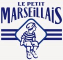
_MARSEILLAIS_ seems to be lettering loosely based on the lower case of A.M. Cassandres quintessentially French font, Peignot, designed in 1937 for for Deberny & Peignot.
Don
Don
Fonte sugerida: Peignot

Not font, but rather a trademark logo owned by Philip Morris http://trademark.markify.com/trademarks/ctm/l++m+quality+american+blend+l+m/009434754
The base letters, before the inline treatment may be derived from Bodoni Campanile, designed by R.H. Middleton for Ludlow, circa 1930. Vertically extended.
Don
The base letters, before the inline treatment may be derived from Bodoni Campanile, designed by R.H. Middleton for Ludlow, circa 1930. Vertically extended.
Don
Fonte sugerida: Bodoni Campanile
Good call koeikat.
The font description is interesting:
----
The Nyala typeface is named for the mountain nyala (tragelaphus buxtoni) a species of great African antelope native to the highlands of Ethiopia. The Ethiopic characters were designed by John Hudson, based on initial drawings by Geraldine Wade. The Latin characters were designed by John Hudson, and harmonise with the Ethiopic to facilitate the typesetting of texts including un-transliterated foreign names, technical terms, etc.
---
Don

Todos os horários são CEST. Agora são 13:54
