
Fórum
3.821 posts Fontes identificadas
Posts por donshottype


Looks like a logo lettered in the creamy brushstroke style popular for dairy and soft paper products.
Club Type Medium Italic and Club Type Bold Italic are similar.
Club Type Medium Italic and Club Type Bold Italic are similar.
Fonte sugerida: Club Type

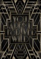
Fonte identificada: Albertus

Note the reverse contrast -- horizontal strokes thicker than vertical.
You get this by compressing the width of the letters.
Good match with College Slab after compressing it.
Don
You get this by compressing the width of the letters.
Good match with College Slab after compressing it.
Don
Fonte sugerida: College Slab

Serpentine Bold Oblique edited for _Deja Vu_
Editado em 14/10/2015 às 10:26 por donshottype
Fonte identificada: Serpentine Bold Oblique
Editado em 14/10/2015 às 10:26 por donshottype

A traditional pen-drawn upright script.
I spotted a few similar fonts but, so far, no exact match.
The closest is Gallegos Pro.
I spotted a few similar fonts but, so far, no exact match.
The closest is Gallegos Pro.
Fonte sugerida: Gallegos

The letterforms look influenced by Hermann Hoffmann's Block for Bethold (1908)
A modern font that reinterprets Block Berthold is Amsi Pro.
Amsi Pro Bold is very close to your letters, except for the leg on the _R_
A modern font that reinterprets Block Berthold is Amsi Pro.
Amsi Pro Bold is very close to your letters, except for the leg on the _R_
Fonte sugerida: Amsi Bold
Atlas, modified.
Don
Editado 2 vezes. Última edição em 13/10/2015 às 15:40 por drf
Don
Fonte sugerida: Atlas
Editado 2 vezes. Última edição em 13/10/2015 às 15:40 por drf
Yes, Aldine 401 is Bitstream's version of Bembo. Both work.
Don
Don

Amsi Pro Cond Bold is a close substitute, even has a similar relaxed _S_ and the rounded tips.
On second thought, Amsi Pro Narrow Bold is a better match.
Don
Editado 2 vezes. Última edição em 13/10/2015 às 13:48 por drf
On second thought, Amsi Pro Narrow Bold is a better match.
Don
Fonte sugerida: Amsi
Editado 2 vezes. Última edição em 13/10/2015 às 13:48 por drf


Hemi Head Bold Italic. Might be an older version.
Edit to close the gaps in the letters.
Don
Editado em 12/10/2015 às 10:14 por donshottype
Edit to close the gaps in the letters.
Don
Fonte sugerida: Hemi Head
Editado em 12/10/2015 às 10:14 por donshottype

Logo looks like a customized Aldine 401 Bold, with the top inside strokes of _M_ rounded from the angular form in the font.
Don
Don
Fonte sugerida: Aldine 401 Bold
Shows some editing, particularly the _B_, or is a derivative font
Don
Editado em 13/10/2015 às 11:09 por drf
Don
Fonte sugerida: Pump Triline
Editado em 13/10/2015 às 11:09 por drf
According to a wiki, Stone Island is an "Italian premium men's apparel brand from Ravarino famous for its compass patch that buttons onto the upper sleeve of the left arm. It belongs to Carlo Rivetti's 'Sportswear Company' (SPW."
This seems to be an image generated by a vector for one of the patches. See hi res image http://abali.ru/wp-content/uploads/2014/01/logo_stone_island.png
Since it is a logo, all bets are off whether it is an unedited font.
Don
This seems to be an image generated by a vector for one of the patches. See hi res image http://abali.ru/wp-content/uploads/2014/01/logo_stone_island.png
Since it is a logo, all bets are off whether it is an unedited font.
Don

Archive French Shaded is a digital version of the font used for _CUCINA_ but the digitization looks rougher than the image and there are some minor differences
Don
Don
Fonte sugerida: Archive French Shaded
Kudos Kaps One NF -- a digitization by Nick Curtis of Georgian Initials -- would make a good substitute.
Don
Don
Fonte sugerida: Kudos Kaps One
This is almost identical to an old metal type called Georgian Initials.
Digitized, by Nick Curtis under another name. See next post.
http://www.donblack.ca/Fonts/g.aspx
Don
Editado 3 vezes. Última edição em 09/10/2015 às 17:01 por drf
Digitized, by Nick Curtis under another name. See next post.
http://www.donblack.ca/Fonts/g.aspx
Don
Fonte sugerida: Georgian Initials
Editado 3 vezes. Última edição em 09/10/2015 às 17:01 por drf
Edited:
The _O_ and _Q_ are different in Rapscallion and Ozzie II, as is the lowercase and numbers. But, in my opinion the upper case of Ozzie II is a rip from Rapscallion.
I standardized the sizes of the two fonts and did an overlay. In the following image Rapscallion's outline for _B_ is in black and Ozzy II's image is in Red:

Plainly there is a point for point rip.
Ozzy II adds a horizontal stretch to some letters, such as _C_ but those letters can be compressed back to a perfect match with Rapscallion.
In my opinion the author of Ozzie II should have mentioned that he took the digital outlines of his upper case from Rapscallion.
Don
Editado em 09/10/2015 às 15:53 por donshottype
The _O_ and _Q_ are different in Rapscallion and Ozzie II, as is the lowercase and numbers. But, in my opinion the upper case of Ozzie II is a rip from Rapscallion.
I standardized the sizes of the two fonts and did an overlay. In the following image Rapscallion's outline for _B_ is in black and Ozzy II's image is in Red:
Plainly there is a point for point rip.
Ozzy II adds a horizontal stretch to some letters, such as _C_ but those letters can be compressed back to a perfect match with Rapscallion.
In my opinion the author of Ozzie II should have mentioned that he took the digital outlines of his upper case from Rapscallion.
Don
Editado em 09/10/2015 às 15:53 por donshottype
Todos os horários são CEST. Agora são 18:08
