
Fórum
3.821 posts Fontes identificadas
Posts por donshottype

Except for the lower terminal on _C_ it looks like Antique No. 8, a metal type produced by Miller & Richard as shown at page 76 of
_Printing Types of the World_ [1931] by Alfred Bastien & G. J. Freshwater.
https://www.amazon.com/PRINTING-WORLD-Alfred-Freshwater-Bastien/dp/B002130B9E
also
https://www.amazon.com/Printing-types-world-comprehensive-advertising/dp/B0006ALQSY
AFAIK no digital.
_Printing Types of the World_ [1931] by Alfred Bastien & G. J. Freshwater.
https://www.amazon.com/PRINTING-WORLD-Alfred-Freshwater-Bastien/dp/B002130B9E
also
https://www.amazon.com/Printing-types-world-comprehensive-advertising/dp/B0006ALQSY
AFAIK no digital.

This was custom lettering.
Perhaps the best match for most of the letters, including the unusual _2_, is Countach, which was developed for Ubisoft's auto racing video game, the Crew.
Compare to the specimen here:
http://www.identifont.com/find?font=Countach&q=Go
The link below shows where it can be purchased
Perhaps the best match for most of the letters, including the unusual _2_, is Countach, which was developed for Ubisoft's auto racing video game, the Crew.
Compare to the specimen here:
http://www.identifont.com/find?font=Countach&q=Go
The link below shows where it can be purchased
Fonte sugerida: Countach

LHF Ridgecrest has sharp points on _V_ like your clock face.
Ignore typo in font name showing link.
Editado em 16/07/2016 às 22:52 por donshottype
Ignore typo in font name showing link.
Fonte sugerida: LHF Ridgecrest Is
Editado em 16/07/2016 às 22:52 por donshottype
Your image does not show the half of the face with _4_. For this type of clock it could be either _IV_ or _IIII_.
Fonte sugerida: Manygo Serif

The lettering was created in an era when thick and thin [stressed] sans were popular.
AFAIK there is no narrow font in this class that comes close to the Church sign.
You might be interested, however, in Erbar Light Condensed, which dates from 1928. This is NOT THE FONT, but has similar proportions, particularly for the oval letters _C_, _O_ and _S_ as well as letters such as _W_ and _M_. Although it is not a not a stressed sans, it could be tweeked to make a rough substitute and provides some insight as to how letters not included in the sign could look.
Editado 2 vezes. Última edição em 15/07/2016 às 21:37 por donshottype
AFAIK there is no narrow font in this class that comes close to the Church sign.
You might be interested, however, in Erbar Light Condensed, which dates from 1928. This is NOT THE FONT, but has similar proportions, particularly for the oval letters _C_, _O_ and _S_ as well as letters such as _W_ and _M_. Although it is not a not a stressed sans, it could be tweeked to make a rough substitute and provides some insight as to how letters not included in the sign could look.
Fonte sugerida: Erbar Condensed
Editado 2 vezes. Última edição em 15/07/2016 às 21:37 por donshottype

Available in ten formats for embroidery machines but, AFAIK not available as a standard digital font
To see the source of your image, click on the faint thumbnail below the script _M_
Editado em 15/07/2016 às 15:55 por donshottype
To see the source of your image, click on the faint thumbnail below the script _M_
Fonte identificada: Cursive Script Applique Embroidery
Editado em 15/07/2016 às 15:55 por donshottype


Fonte identificada: Broadway
Fonte identificada: Vivaldi

Fonte identificada: Poster Bodoni

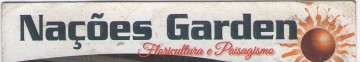
Custom logo.
The closest substitute is perhaps Vtg Stencil US No 4 Paint Low. Note that this is NOT THE FONT
Vtg Stencil US No 4 is also available in a smooth version.
Also similar is Vtg Stencil US No 2, which is available only in a smooth version.
http://myfonts.us/td-N5qZDj
The closest substitute is perhaps Vtg Stencil US No 4 Paint Low. Note that this is NOT THE FONT
Vtg Stencil US No 4 is also available in a smooth version.
Also similar is Vtg Stencil US No 2, which is available only in a smooth version.
http://myfonts.us/td-N5qZDj
Fonte sugerida: Vtg Stencil US No 4 Paint Low
Fonte sugerida: American Typewriter Medium Condensed


Fonte identificada: Arrus BT

Continental Railway is another with the same type of character linking but different characters
Fonte sugerida: Continental Railway
Todos os horários são CEST. Agora são 00:33
