DearJoe 7
DearJoe 7 por JOEBOB graphics 
em Escrita > Manuscrita
10.499 downloads Demo - 2 arquivos de fonte
dearJoe 7 TRIAL.ttfNota do autor
The dearJoe series of fonts came to life around the year 1999, when I created dearJoe 1, which was a first (and half-assed) attempt to convert my own handwriting into a working font. Being able to type in my own hand had always been a childhood fantasy, and even though I only partly understood the software, a working font was generated and I decided to put it on the internet for people to use in their own personal projects.
Which they did: at this moment the dearJoe 1 font has been downloaded millions of times and can be found on Vietnamese riksjas, Tasmanian gyms and chocolate stores on 5th Avenue for instance.
The font is not something I am particularly proud of, but it started me of in building what's now the JOEBOB graphics foundry.
Inbetween creating other fonts, the dearJoe series has become a theme I revisit every once in a while, trying to create an update on how my handwriting has evolved, along with my abilities in creating fonts that mimic actual handwriting. In the last decade or so I started implementing ligatures and alternate characters, which helped a lot in coming to a result that can almost pass for actual handwriting.
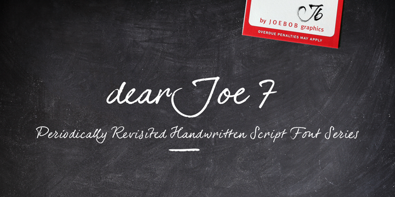
The 2019 dearJoe 7 font is the latest addition to this font family.
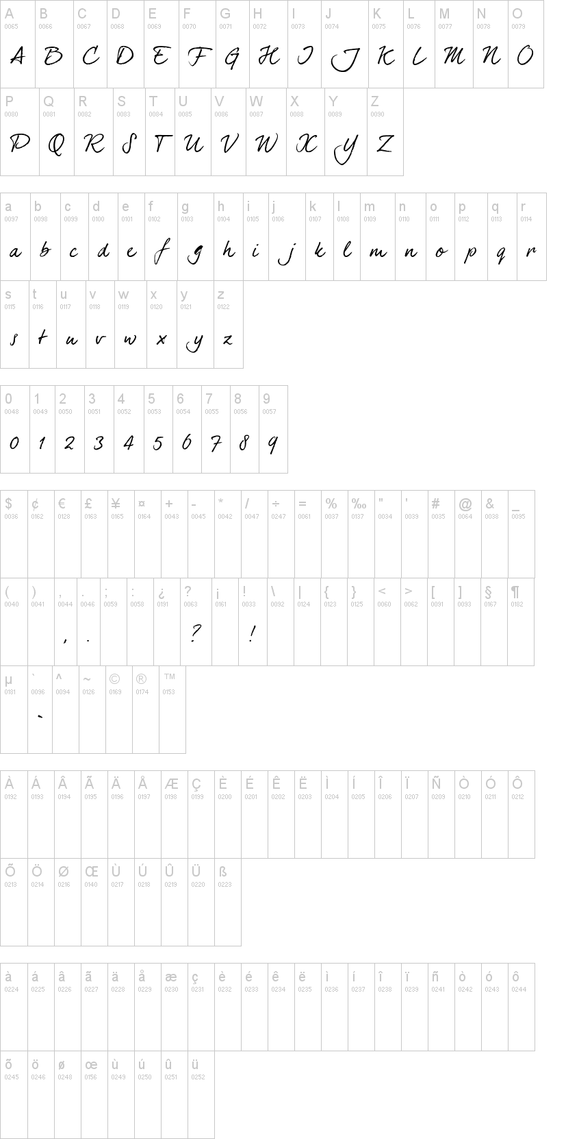
All characters in the complete font were scanned from handwritten notes, cherrypicking the characters and letter-combinations I liked best. They were written with a Lamy M66 B pen and only minor adjustments were made to the original scans, leaving most little flaws and rough edges as they were for a convincing ball-point on paper result.
The font comes with over 150 ligatures, making sure the font has a variated and credible overall look and feel.
You can download a TRIAL version of the font here on Dafont. Please note that it comes without the ligatures and it is not printable. For a complete, working version please go to https://www.joebobgraphics.com/fonts/dearjoe-7/
Visto pela primeira vez no DaFont: 12/06/2019


