
 English
  Français
  Español
  Deutsch
  Italiano
  Português
Forum
15 posts Solo richieste
Posts di TomeTome


If anyone is looking for a font for the text "available…" you go can try the Manuscript font. It also contains 4 different images of letters, numbers and additional characters.
Carattere suggerito: Manuscript

If it help someone, i found it include italic version also.
Carattere suggerito: Poets (Già suggerito qua)
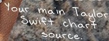
Not the same but based on Taylor's font. 4 different letters and digits. Check this out!
Carattere suggerito: Manuscript

You can try this one. Is not exactly the same but you have there 3 stylistyc sets extra + some ligatures.
Carattere suggerito: Manuscript

Try this one. I think that is what you are looking.
Modificato su 10/03/2024 alle 06:45 da TomeTome
Carattere suggerito: Poets
Modificato su 10/03/2024 alle 06:45 da TomeTome

bast.alec_ ha detto 
If is really the font, how will you explain the small details such as the curves in the uppercase letters. I did reasearch about the font you sent and found just SOME simmilarities.
Check this. Maybe this is what are u looking
admin edit: knock-off link removed
Carattere suggerito: Poets
Modificato 2 volte. Ultima modifica su 23/02/2024 alle 15:21 da marty666
akira1975 ha detto
TomeTome ha detto
The correct font is similar to Big Caslon, but if you look closely you will notice differences in details.
There are no sharp angles in it. For example look at „H”, „P” or „M”.
I think that every character in this font looks different than in Big Caslon.
There are no sharp angles in it. For example look at „H”, „P” or „M”.
I think that every character in this font looks different than in Big Caslon.
They definitely altered Big Caslon to make the font. That’s why the font is a knock-off, even though there are differences between them.
You mustn’t alter Big Caslon to design another font.
Probably you have right.
The correct font is similar to Big Caslon, but if you look closely you will notice differences in details.
There are no sharp angles in it. For example look at „H”, „P” or „M”.
I think that every character in this font looks different than in Big Caslon.
Modificato su 19/02/2024 alle 07:12 da TomeTome
There are no sharp angles in it. For example look at „H”, „P” or „M”.
I think that every character in this font looks different than in Big Caslon.
Modificato su 19/02/2024 alle 07:12 da TomeTome
Try this
admin edit: knock-off link removed
Modificato 2 volte. Ultima modifica su 23/02/2024 alle 15:20 da marty666
admin edit: knock-off link removed
Carattere suggerito: Poets
Modificato 2 volte. Ultima modifica su 23/02/2024 alle 15:20 da marty666
Really? Unfortunately, most of the fonts inspired by this logo, whether on Etsy or other sites, are of very poor quality. Does anyone really want to do this right if they want to takie money from it? The rest of the letters look awkward in them. I'm not even talking about numbers :(
ed33pl ha detto
There's a custom font. You can find it here
Valinor
Valinor
Finally there's full character set include!
Stone-Android ha detto
ed33pl ha detto
I hope it would be helpful.
Mallorn
Mallorn
Thanks for this. Would I be right in assuming these are recreations and not the originals used in the show?
I have finally got this font and the quality is really very good. Very well reproduced lettering. Professional work.
Perfect. Thank You!
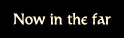
Do you know what font is this? Please help!
Fuso orario: CEST. Ora sono le 12:01
