
Forum
3.821 posts Caratteri Identificati
Posts di donshottype


Carattere Identificato: Arnold Boecklin

EDITED
I should have refreshed the page before posting this. Jerseygirl had already found the font.
ORIGINAL POST:
Don't have a distressed or rubber stamp version of these gothic or grotesque letters, but for a substitute rubber stamp gothic -- NOT THE FONT -- you could use Profumo, which has a similar ampersand.
A similar clean version of the ampersand is found in Railroad Gothic and Gothic RR Bold Condensed http://www.myfonts.com/fonts/redrooster/gothic-rr/bold-condensed/glyphs.html#glyphs/618440/9
Modificato su 25/08/2016 alle 10:14 da donshottype
I should have refreshed the page before posting this. Jerseygirl had already found the font.
ORIGINAL POST:
Don't have a distressed or rubber stamp version of these gothic or grotesque letters, but for a substitute rubber stamp gothic -- NOT THE FONT -- you could use Profumo, which has a similar ampersand.
A similar clean version of the ampersand is found in Railroad Gothic and Gothic RR Bold Condensed http://www.myfonts.com/fonts/redrooster/gothic-rr/bold-condensed/glyphs.html#glyphs/618440/9
Carattere suggerito: Profumo
Modificato su 25/08/2016 alle 10:14 da donshottype

Looks like a logo, so there may not be an exact match 
Similarities to various Caslon fonts, Caslon Bold, Caslon 3 etc. but these are NOT THE FONT
The leg on _R_ is similar to Perpetua Bold
http://myfonts.us/td-CiMwTu
Modificato su 24/08/2016 alle 23:53 da donshottype

Similarities to various Caslon fonts, Caslon Bold, Caslon 3 etc. but these are NOT THE FONT
The leg on _R_ is similar to Perpetua Bold
http://myfonts.us/td-CiMwTu
Carattere suggerito: Caslon Bold
Modificato su 24/08/2016 alle 23:53 da donshottype

Carattere Identificato: Stencil

Carattere Identificato: Broadway
Designed by "Will" a "graphic designer for hire" in the U.K.
See letterpress business cards:
http://www.blushpublishing.co.uk/pages/desypha
Currently active on Twitter
https://twitter.com/desypha
Info at linkedin
https://www.linkedin.com/company/desypha
Has a page on dribble, but last entry is in 2014
https://dribbble.com/desypha
His website is no longer active.
Perhaps geometric lettering rather than a font.
Some similarities to German "Jackboot" blackletter fonts of the 1930s: Element, National etc.
Modificato 2 volte. Ultima modifica su 24/08/2016 alle 15:45 da donshottype

Logo made from NewsFlash BB
The _A_ is _U_ flipped and with crossbar added.
The _C_ is _O_ with a section clipped out.
Slight thickening of the letters for effect
An example of how logo makers can make easy bucks with a few minutes work tweaking a free font
Modificato 2 volte. Ultima modifica su 24/08/2016 alle 13:47 da donshottype
The _A_ is _U_ flipped and with crossbar added.
The _C_ is _O_ with a section clipped out.
Slight thickening of the letters for effect
An example of how logo makers can make easy bucks with a few minutes work tweaking a free font

Carattere Identificato: Newsflash BB
Modificato 2 volte. Ultima modifica su 24/08/2016 alle 13:47 da donshottype

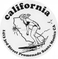
Carattere Identificato: Generica

Carattere Identificato: Corsiva
Carattere Identificato: Cooper Black

Width narrowed for _PUERTO VALLARTA_
Other words are not edited
Other words are not edited
Carattere Identificato: Bookman Old Style Bold
Originally designed by Rudolf Koch for the Klingspor font foundry in Offenbach, Germany in 1925 and sold as Wilhelm Klingspor Gotisch
Pay versions
Wilhelm Klingspor Gotisch
http://myfonts.us/td-sHzlq3
Wilhelm Klingspor Schrift
http://myfonts.us/td-xHh53a
Note: the _k_ in Killigrew is a tz-ligature in the pay versions
Modificato 2 volte. Ultima modifica su 22/08/2016 alle 22:10 da donshottype
Pay versions
Wilhelm Klingspor Gotisch
http://myfonts.us/td-sHzlq3
Wilhelm Klingspor Schrift
http://myfonts.us/td-xHh53a
Note: the _k_ in Killigrew is a tz-ligature in the pay versions
Carattere Identificato: Killigrew
Modificato 2 volte. Ultima modifica su 22/08/2016 alle 22:10 da donshottype

The letters could perhaps have been made by modifying ITC Machine Medium
Carattere suggerito: Machine Medium
Custom logo for the Atlanta Hawks
More letters from another version of the logo

Usually described as having a "Latin" or triangular serif. No fonts in this category are an exact match.
More letters from another version of the logo
Usually described as having a "Latin" or triangular serif. No fonts in this category are an exact match.
For _C_ and _U_ this is a poor quality digitization of Joseph Gille's font of about 1820
Cleaned up versions as:
Gille Classic
http://myfonts.us/td-S62iGZ
Home Style
http://myfonts.us/td-TChtFY
Madame
http://myfonts.us/td-XwUV2C
Other names Circus and Roma. No legitimate downloads.
Cleaned up versions as:
Gille Classic
http://myfonts.us/td-S62iGZ
Home Style
http://myfonts.us/td-TChtFY
Madame
http://myfonts.us/td-XwUV2C
Other names Circus and Roma. No legitimate downloads.

For _R_ and _S_
Also a slightly different cleaned up version as Main Strike
http://myfonts.us/td-s2G5Nk
Another free version: Ringmaster JF
http://www.moorstation.org/typoasis/designers/jfs/ringmaster.html
Also a slightly different cleaned up version as Main Strike
http://myfonts.us/td-s2G5Nk
Another free version: Ringmaster JF
http://www.moorstation.org/typoasis/designers/jfs/ringmaster.html
Carattere Identificato: BraceletVictorian

Horizontally expanded for _Metal_
As is for _Central_
Minor edit: top of _n_ smoothed
As is for _Central_
Minor edit: top of _n_ smoothed
Carattere Identificato: Serpentine Sans Bold
Fuso orario: CEST. Ora sono le 21:55
