
Forum
393 posts Caratteri Identificati
Posts di conman1985


Industria Solid for A JOHN WOO FILM, the tag line underneath and Los Angeles Times quote at the top.
Carattere suggerito: Industria Solid
For KILLER, a squeezed-up Metropolis, first designed in 1928. There are various digitizations.
Carattere suggerito: Metropolis
Carattere suggerito: Eurostile Bold

Carattere Identificato: Druk Condensed Super

Mix and match of Futura ExtraBold Oblique and Helvetica Black Oblique.
Carattere Identificato: Futura ExtraBold Oblique
Carattere suggerito: Helvetica
Modificato su 20/04/2018 alle 11:28 da frd

Looks like Futura Condensed Medium to me. Also very close to Function Pro Medium Condensed.
Carattere Identificato: Futura Condensed Medium
Carattere Identificato: Akzidenz Grotesk Ext Bold

Carattere Identificato: Galant
Likely NewCompact, an early Mac Type 1 Postscript family of 4 fonts (with additional extended and oblique versions) created by David C. Saunders in April, 1989. A TrueType version from 1992 is still floating around the web - most likely a slightly altered clone as it includes an Altsys Metamorphosis tag and no author credit to David C. Saunders. The VHS has a copyright of 1990, so I would guess it was designed using the original Mac Type 1 version.
There's also Mustang Sans, a Spice Girls accurate recreation which features the wider E, F and L as well as more accurate numerals and punctuation.
Find Mustang Sans here:
https://www.dafont.com/forum/read/251505/does-anyone-know-this-spice-girls-font
VHS cover type comparison with NewCompact TrueType:
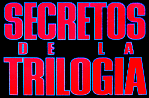
Modificato 3 volte. Ultima modifica su 18/04/2018 alle 04:46 da conman1985
There's also Mustang Sans, a Spice Girls accurate recreation which features the wider E, F and L as well as more accurate numerals and punctuation.
Find Mustang Sans here:
https://www.dafont.com/forum/read/251505/does-anyone-know-this-spice-girls-font
VHS cover type comparison with NewCompact TrueType:
Modificato 3 volte. Ultima modifica su 18/04/2018 alle 04:46 da conman1985

Original is Baker Danmark (1976) by Arthur Baker. URW++ have a digital version named Danmark.
Modificato 2 volte. Ultima modifica su 10/04/2018 alle 09:48 da conman1985
Carattere Identificato: Danmark
Modificato 2 volte. Ultima modifica su 10/04/2018 alle 09:48 da conman1985

Original is Baker Danmark (1976) by Arthur Baker. URW++ have a digital version named Danmark. Danmark Extra Bold for BATMAN, Danmark Bold for the rest.
Modificato 2 volte. Ultima modifica su 10/04/2018 alle 09:49 da conman1985
Carattere Identificato: Danmark
Modificato 2 volte. Ultima modifica su 10/04/2018 alle 09:49 da conman1985
I believe the original titling may have been hand-lettered, perhaps inspired by Permanent Massiv (1967) or a widened Compacta Bold (1963). Compacta Black was not released until 1976, which rules it out despite seeming a closer fit. Permanent Headline (1964) was used for the "THIS MAN IS JAMES BOND" copy on the YOU ONLY LIVE TWICE 2-Sheet Advance Movie Poster, which may support the notion of Permanent Massiv as the original inspiration.

Carattere Identificato: Britannic Bold
The original typeface is Matrix II Wide. 007 GoldenEye is a knockoff inspired by the logo.
Carattere Identificato: Matrix II Wide

Carattere Identificato: Century Gothic

I believe the book titles and James Bond branding are custom type treatments, probably hand drawn as needed. If you look at the entire series of Gardner US hardcovers you will see a number of inconsistencies between the letterforms, particularly the B's, C's and S's. A close substitute may be Silverado by Red Rooster, previously a pre-digital typeface called Eldorado by Les Usherwood. Silverado Extra Bold and Extra Bold Condensed would look quite similar with a few tweaks. The rest of the type is set in Kabel Heavy.
Carattere suggerito: Kabel Heavy
IAN FLEMING'S script looks hand drawn as the n's don't match. JAMES BOND is set in pre-digital Othello, with the A being made from a rotated V.

Modificato 2 volte. Ultima modifica su 05/04/2018 alle 06:48 da conman1985
Modificato 2 volte. Ultima modifica su 05/04/2018 alle 06:48 da conman1985

The STAR WARS logo on this poster was likely custom. A very similar logo also appears on the 1977 paperback edition of STAR TRIAL by Irving A. Greenfield. It's possible the letterforms are based upon Jay Gothic, a 1965 typeface that was also used for the titles in the original 1966-69 STAR TREK series.
Modificato 4 volte. Ultima modifica su 23/12/2017 alle 11:00 da marty666
Carattere suggerito: Jay Gothic
Modificato 4 volte. Ultima modifica su 23/12/2017 alle 11:00 da marty666

It is Jay Gothic Bold designed by Jay Schecter. Available from Visual Graphics Corporation since 1965 it originally included the alternate 'R' seen in your sample.

Modificato su 23/12/2017 alle 10:42 da marty666
Carattere suggerito: Jay Gothic Bold
Modificato su 23/12/2017 alle 10:42 da marty666
Fuso orario: CEST. Ora sono le 17:13
