
Forum
6.104 carattere identificatos Tutti i post Solo richieste
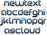
Caratteri Identificati da Heron2001


Carattere Identificato: Choc

Carattere Identificato: Paola

Carattere Identificato: Vivaldi

Three fonts used: Bold. Bold Italic. Bold Condensed (for the numbers)
Modificato su 03/10/2016 alle 19:45 da Heron2001
Carattere Identificato: Avant Garde Gothic
Modificato su 03/10/2016 alle 19:45 da Heron2001


Carattere Identificato: Arab Brushstroke

Carattere Identificato: Optima

Carattere Identificato: Bodoni Poster

Carattere Identificato: Platthand

Carattere Identificato: Queen of the Moon

Carattere Identificato: Dear Joe


Carattere Identificato: Roboto Slab

I don't know if this is a font - or just so distorted it doesn't look like one. (The Rs and As do not match, and the waviness through it -- isn't, um, balanced.)
But there is a font on dafont that may do the trick for you - if you run it through a few filters and condensed the crap out of it.
But there is a font on dafont that may do the trick for you - if you run it through a few filters and condensed the crap out of it.
Carattere Identificato: Silver Dollar

I have a feeling this is Tiepolo that has been condensed manually then arched.
Carattere Identificato: Tiepolo

Carattere Identificato: Scratch Super Sketchy Script
Fuso orario: CEST. Ora sono le 14:13
