
Forum
15 posts
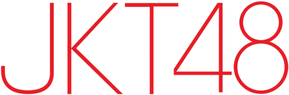
JKT48 (idol group from Jakarta)
font??
Avant Garde ExtraLight Suggeriti da koeiekat
Movatif Suggeriti da frd
Dominik Suggeriti da heyfany
Olyford Extra Light Suggeriti da xy.0
Sevigne Suggeriti da LittleMixStooshe&NickiMinajFanNZ
Carattere Identificato
Avant Garde ExtraLight Suggeriti da koeiekat
Caratteri suggeriti
Movatif Suggeriti da frd
Dominik Suggeriti da heyfany
Olyford Extra Light Suggeriti da xy.0
Sevigne Suggeriti da LittleMixStooshe&NickiMinajFanNZ
i dont know
Carattere suggerito: Sevigne

"KT48" ("4" is slightly modified)
Modificato su 20/10/2012 alle 17:35 da SashiX
Carattere Identificato: Avant Garde ExtraLight
Modificato su 20/10/2012 alle 17:35 da SashiX

I hate to be that guy, but I don't see it, koeiekat. Which version do you mean?

This one I'd say, but yes, you're not the only one, montpetit 
EDIT: nah, fixed myself.
Modificato su 20/10/2012 alle 17:43 da SashiX

EDIT: nah, fixed myself.
Modificato su 20/10/2012 alle 17:43 da SashiX
koeiekat ha detto
"KT48" ("4" is slightly modified)
Avant Garde ExtraLight
Avant Garde ExtraLight
The J seems to be the Helvetica 23 Ultra Light Extended.
koeiekat ha detto
koeiekat ha detto
"KT48" ("4" is slightly modified)
Avant Garde ExtraLight
Avant Garde ExtraLight
The J seems to be the Helvetica 23 Ultra Light Extended.
Already checked that, it's not Helvetica (have tried 2 Helveticas at least
 )
)The only thing that bothers me is the thickness of that "J" - matches perfectly the thickness of other letters

Modificato su 20/10/2012 alle 18:01 da SashiX
Maybe...
Carattere suggerito: Dominik
SashiX ha detto
... Already checked that, it's not Helvetica (have tried 2 Helveticas at least  )
)
The only thing that bothers me is the thickness of that "J" - matches perfectly the thickness of other letters
)The only thing that bothers me is the thickness of that "J" - matches perfectly the thickness of other letters
You're right, it is not a Helvetica neue. I have checked all versions I could lay may hands on (which is a hefty multiplication of 2) and that J does not match. For thickness the one I suggested matches. But not for shape. Alas.
After looking at many versions of the JKT48 logo (lots of differences), my guess is that it was originally based on Avant-Garde but has been hand-rendered several time by fans or even graphic artists. The left corner of number 4 is cut, and the J is crooked at its lower right.
Also, my wife caught me looking at the Google image results full of asian teen girls and she was like: ಠ_ಠ
Also, my wife caught me looking at the Google image results full of asian teen girls and she was like: ಠ_ಠ
Boobs slammer?

Hum, how about a prior version of this one ? As far as I remember, Ray Larabie can do major changes when he updates his fonts, so... why not ?
Carattere suggerito: Movatif
Nope. Nothing matches and the J is still completely different. I've gone from here to eternity to find that J but nothing found. Which is rare.
Modificato su 20/10/2012 alle 23:06 da koeiekat
Modificato su 20/10/2012 alle 23:06 da koeiekat
For "KT48", AG matches perfectly, except that left part of "4".
Thanks God she didn't see you posting in Florin's thread
fmontpetit ha detto
Also, my wife caught me looking at the Google image results full of asian teen girls and she was like: ಠ_ಠ
Thanks God she didn't see you posting in Florin's thread
Carattere suggerito: Olyford Extra Light
Fuso orario: CET. Ora sono le 09:54
