
Forum
3 821 posts Polices identifiées
Posts par donshottype


Police identifiée : Bremen

LEON SCHLESINGER is also hand lettered.
Not close to any digital font, but to approximate it you could use Condor Black:

or Condor Condensed Black
Not close to any digital font, but to approximate it you could use Condor Black:
or Condor Condensed Black
Police suggérée : Condor Black
Hand-lettered, but seems to have inspired the creation of Alphabet Soup Tilt.
LOONEY TUNES, mixing upper & lower case letters:

Ovdrlap the letters for the effect.
Édité le 10/07/2019 à 11:11 par donshottype
LOONEY TUNES, mixing upper & lower case letters:
Ovdrlap the letters for the effect.
Police suggérée : Alphabet Soup Tilt
Édité le 10/07/2019 à 11:11 par donshottype

Sign with some adjustment of perspective:

No match found.
For a similar vibe -- but NOT A MATCH -- check out he concave strokes and spiky tips in Portcullion.
This is a 19th century font design. Pay versions with the name Black Rose by Font Mesa, LHF Old Blackletter and Portculliard by Greater Albion Typefounders.
No match found.
For a similar vibe -- but NOT A MATCH -- check out he concave strokes and spiky tips in Portcullion.
This is a 19th century font design. Pay versions with the name Black Rose by Font Mesa, LHF Old Blackletter and Portculliard by Greater Albion Typefounders.
Police suggérée : Portcullion
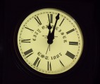
Re-lettered to fit curve. Horizontal lattice cut from counters of _Y_, _O_ and _W_.
Édité le 09/07/2019 à 07:31 par donshottype
Police identifiée : Engravers Old English
Édité le 09/07/2019 à 07:31 par donshottype

Note that the horizontal strokes are thicker than the vertical strokes. This shows that the poster maker further compressed a condensed font to make the letters.
I did not find an exact match to a retail font for the source. The source font might be a private font used by the studio to avoid paying royalties for use.
You can get close by using Triple Condensed Gothic RR Bold, after it is compressed to about 66% width:

Édité 3 fois. Dernière édition le 09/07/2019 à 07:10 par donshottype
I did not find an exact match to a retail font for the source. The source font might be a private font used by the studio to avoid paying royalties for use.
You can get close by using Triple Condensed Gothic RR Bold, after it is compressed to about 66% width:
Police suggérée : Triple Condensed Gothic RR
Édité 3 fois. Dernière édition le 09/07/2019 à 07:10 par donshottype

Police identifiée : Castellar Roman
Updated:
The EF version of Lucida Calligraphy
https://www.myfonts.com/fonts/ef/lucida-calligraphy/
is not identical to the Monotype/URW version in the link below.
But either matches with some editing.
Édité 5 fois. Dernière édition le 09/07/2019 à 05:32 par donshottype
The EF version of Lucida Calligraphy
https://www.myfonts.com/fonts/ef/lucida-calligraphy/
is not identical to the Monotype/URW version in the link below.
But either matches with some editing.
Police suggérée : Lucida Calligraphy
Édité 5 fois. Dernière édition le 09/07/2019 à 05:32 par donshottype

NUCLEO, width is compressed to about 75%.
COMPATTO, width is compressed to about 70%.
COMPATTO, width is compressed to about 70%.
Police identifiée : Freshman

Gótico Cervantes - Fundición Tipográfica Richard Gans - Madrid, 1928.
A digital version is being developed by Alter Littera [José Alberto Mauricio], a Spanish foundry, located in Madrid.
A digital version is being developed by Alter Littera [José Alberto Mauricio], a Spanish foundry, located in Madrid.
Police suggérée : Gótico Cervantes

Police identifiée : Blacksword

Another similar with an overhead ear on _g_.
Bitstream and Monotype versions.
Édité le 04/07/2019 à 08:05 par donshottype
Bitstream and Monotype versions.
Police suggérée : Modern No. 20
Édité le 04/07/2019 à 08:05 par donshottype
The ref to "100% cotton" in the lower lhs implies that this is a clothing label.
The _Make It Right_ seems to be a logo rather than a font as such.
It is in the style of Scotch and Modern fonts, but I did not spot any that are an exact match.
Closest is perhaps Modern Light by Image Club Graphics. It has an overhead ear on _g_.

No legitimate download.
The _Make It Right_ seems to be a logo rather than a font as such.
It is in the style of Scotch and Modern fonts, but I did not spot any that are an exact match.
Closest is perhaps Modern Light by Image Club Graphics. It has an overhead ear on _g_.
No legitimate download.
Police suggérée : Modern Light ICG

Police identifiée : Agency

Compressed by user. There is a compressed Broadway but it is narrower.
Édité le 02/07/2019 à 23:40 par donshottype
Police identifiée : Broadway
Édité le 02/07/2019 à 23:40 par donshottype

Does not match any font. But for the vibe, this should do the trick.
Édité le 30/06/2019 à 10:19 par donshottype
Police suggérée : Doobie
Édité le 30/06/2019 à 10:19 par donshottype

Looks like your keyboard uses Microsoft Sans Serif, with minor changes, notably the apex/vertex on _W_ and _M_.

Microsoft Sans Serif is supplied with Microsoft Windows Products.
p.s. the keyboard I am typing this on is a 100% match, including the _W_ and _M_.
Édité le 25/06/2019 à 17:09 par donshottype
Microsoft Sans Serif is supplied with Microsoft Windows Products.
p.s. the keyboard I am typing this on is a 100% match, including the _W_ and _M_.
Police suggérée : Microsoft Sans Serif
Édité le 25/06/2019 à 17:09 par donshottype

The _C_ is modified. The top of _p_ is clipped.
Édité 2 fois. Dernière édition le 23/06/2019 à 16:12 par donshottype
Police identifiée : Snell Roundhand
Édité 2 fois. Dernière édition le 23/06/2019 à 16:12 par donshottype

Closest font for the base letters, without the windswept feature, is Helvetica Diagonal BQ:

Produced by Bethold in 1992. Not currently offered on the Berthold website.
Produced by Bethold in 1992. Not currently offered on the Berthold website.
Police suggérée : Helvetica Diagonal BQ
Looks like the the windswept feature from Slim Stravinsky, suggested by kapilsnj, was pasted onto a solid sans serif. There is no legitimate download for Slim Stravinsky. Internal font info: Slim Stravinsky SH Copyright (c) 1993 Soft Horizons. I don't know if Slim Stravinsky SH is an original work or is a clone of a font created elsewhere.
Édité le 22/06/2019 à 14:16 par donshottype
Édité le 22/06/2019 à 14:16 par donshottype
Fuseau horaire : CEST. Il est actuellement 00:46
