

Forum
3 821 posts Polices identifiées
Posts par donshottype


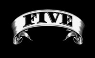
Found more letters for _LEGENDS_on a trailer for the game:

Duke fill is a match.
Modified by adding a Dynamo style demi-serif to make _APEX_
Duke fill is a match.
Modified by adding a Dynamo style demi-serif to make _APEX_
Police suggérée : Duke Fill

Police identifiée : Eksell Display

Police identifiée : Macbeth


Police identifiée : Droid Serif Bold

Masheen released by Robert Schenk has a similar structure, except for the _M_. The 3d effect and riveted steel texture is added artwork
Police suggérée : Masheen

For the _8_, Poster Bodoni is an approximation. The counters are too closed.
Police suggérée : Poster Bodoni
Police identifiée : Bodoni Bold
The numbers on U.S. Indian Head cent coins were similar throughout the second half of the 19th century but as this selection of years shows there is some variation:

The numbers are derived from the "fatface" designs of Robert Thorne’s Fann Street Foundry around 1810. A hairline serif version is currently offered as Thorowgood.
More substantial serifs, like the ones used in the coins, are found in Thorne Shaded.
Digital version made by OPTI.
Thorne Shaded could be used as an approximate match if the shadow was deleted.
The closest match for most of the numbers, without editing, is perhaps Engravers Bold Face, originally designed by Morris Fuller Benton for American Type Founders in 1902.
Digital version offered by Linotype and Adobe.
There is also a digital version by Malcolm Wooden which has a bolder treatment closer to the coins than the Linotype version.
Édité le 02/02/2019 à 10:44 par donshottype
The numbers are derived from the "fatface" designs of Robert Thorne’s Fann Street Foundry around 1810. A hairline serif version is currently offered as Thorowgood.
More substantial serifs, like the ones used in the coins, are found in Thorne Shaded.
Digital version made by OPTI.
Thorne Shaded could be used as an approximate match if the shadow was deleted.
The closest match for most of the numbers, without editing, is perhaps Engravers Bold Face, originally designed by Morris Fuller Benton for American Type Founders in 1902.
Digital version offered by Linotype and Adobe.
There is also a digital version by Malcolm Wooden which has a bolder treatment closer to the coins than the Linotype version.
Police suggérée : Engravers DT
Édité le 02/02/2019 à 10:44 par donshottype

Police identifiée : Kath
Redrawn by user with cove serifs & 3d effect added
Édité le 30/01/2019 à 18:06 par donshottype
Police identifiée : Bodoni Ultra
Édité le 30/01/2019 à 18:06 par donshottype
Robert Indiana (born Robert Clark) created “LOVE” for a Museum of Modern Art Christmas card in 1965. A sculpture, which looks slightly different, was made in 1970.
ID asked many times before in various fora & no definitive ID.
Looks similar to a Bodoni if it has the stroke weight of a Clarendon.
AFAIK no matching font.
Édité le 30/01/2019 à 03:20 par donshottype
ID asked many times before in various fora & no definitive ID.
Looks similar to a Bodoni if it has the stroke weight of a Clarendon.
AFAIK no matching font.
Édité le 30/01/2019 à 03:20 par donshottype


The Monotype version. The other versions have a different acute accent for the _o_
Édité le 29/01/2019 à 21:11 par donshottype
Police identifiée : Brush Script
Édité le 29/01/2019 à 21:11 par donshottype

Seems to be custom letters for a logotype.
Lazenby Computer is a similar font available free here at Dafont. Letters follow same pattern except _O_ and _H_. Other variations offered under assorted names: computer, checkbook, data, mycalc, timemachine etc.
Lazenby Computer is a similar font available free here at Dafont. Letters follow same pattern except _O_ and _H_. Other variations offered under assorted names: computer, checkbook, data, mycalc, timemachine etc.
Police suggérée : Lazenby Computer

Custom wordmark.
AFAIK no matching font.
But I like Citadel Script for use as an approximate subsitute, largely because of the _C_ and _S_.
AFAIK no matching font.
But I like Citadel Script for use as an approximate subsitute, largely because of the _C_ and _S_.
Police suggérée : Citadel Script
Custom logo by Tal Leming
https://typesupply.com/portfolio/buzzfeed-news
AFAIK a font was not produced.
https://typesupply.com/portfolio/buzzfeed-news
AFAIK a font was not produced.
Fuseau horaire : CEST. Il est actuellement 20:43
