
Forum
1 704 police identifiées Tous les posts Requêtes seulement
Polices identifiées par sjh


It looks likes Baylee Outline was the starting point for the sample.
Police identifiée : Baylee Outline


I am guessing that the D was modified: the upstroke was clipped off. Also, the an in Dan is a ligature, which is why the n looks different. See page 5 of the glyph list, at https://fbcd.co/font-specification/d3b17fa0f6c5184d27a25e2deb6a74db/British+Hanwritten+font+with+40+eps+illustration+..pdf
Police identifiée : British

Police identifiée : Here Comes The Sun

Police identifiée : Quiche Sans

Police identifiée : Amsterdam Four

Police identifiée : Rakesly
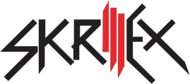
Actually, this typeface was inspired by the Skrillex logo above. The logo came first.
Police identifiée : Scary Glyphs and Nice Characters

You would probably get a good match from any Helvetica clone in a thin condensed style.
Police identifiée : Europa Grotesk No. 2 Extra Light Condensed


Police identifiée : Northwell

Police identifiée : Mighty Slab One

Police identifiée : Golfmind
Police identifiée : Sifonn


Ohana and family. The sample is horizontally compressed from the original. Nothing yet for MEANS.
Police identifiée : Autumn in November

This is pretty close for the CELEBRATION PROGRAMS! text. I am having no luck on the remaining typeface.
Police identifiée : Aviano Sans Light
This covers the YOURS TRULY, For week beginning..., THURSDAY EVE..., and the days and dates (in reverse type).
Police identifiée : Meatball
Fuseau horaire : CEST. Il est actuellement 01:34
