
Forum
1 704 police identifiées Tous les posts Requêtes seulement
Polices identifiées par sjh


Police identifiée : 28 Days Later

The NO MORE looks like Syntax Error, but with the characters horizontially stretched (the N and second O are cut off, of course).
Stuck on MA BOY, so hope theres other help for you.
Édité le 19/01/2024 à 06:14 par sjh
Stuck on MA BOY, so hope theres other help for you.
Police identifiée : Syntax Error
Édité le 19/01/2024 à 06:14 par sjh

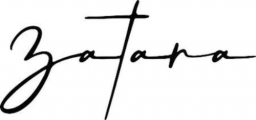
To get your result, you can set "Za ta ra" and then move things around. Otherwise, you get ligatures with different looking glyphs. Or, maybe there are stylistic alternates.
Police identifiée : Siestha

Bebas Neue is not a good match (diferent R; the cuts on the ends of the S), and the Bebas at Dafont has a broken # sign, or so it looks.
Police identifiée : Bebas
Police identifiée : Emilea


Police identifiée : Floridian Script

Looks like a mashup of Messenger (the lower case letters) and Messenger Alt (the upper case letters).
Police identifiée : Messenger

Police identifiée : Gorgonzo

Police identifiée : Creattion

The main body of text (from INVITACION through 3:00 P.M.) is Montserrat, in a couple of weights.
Police identifiée : Montserrat


I think this is actually two typefaces: heres Be
Édité le 17/01/2024 à 18:32 par sjh
Police identifiée : Sorinka Carved
Édité le 17/01/2024 à 18:32 par sjh

Police identifiée : Berkshire Swash

Police identifiée : Mariage
Fuseau horaire : CEST. Il est actuellement 01:02
