
Forum
6 105 police identifiées Tous les posts Requêtes seulement
Polices identifiées par Heron2001

Police identifiée : Angie

Police identifiée : BrushSand
Police identifiée : Eurostile


Please write the designer - you can send him a private message
http://www.dafont.com/pm/post.php?user=346536
Édité le 06/12/2016 à 10:47 par frd
http://www.dafont.com/pm/post.php?user=346536
Police identifiée : Coolock Black
Édité le 06/12/2016 à 10:47 par frd
Police identifiée : Digital Strip

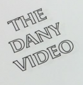
Police identifiée : Black Cherry Moon

Police identifiée : Ariston


The y and & are all wrong - but this might help you fake it... in Didot Regular
Police identifiée : AW Conqueror Didot

Google Font Montserrat - they use to have it in a thin (hairline) weight - but I can't find it for you -- but look at the regular - you'll see the glyphs.
I take that back - found it!
Édité le 24/11/2016 à 18:03 par Heron2001
I take that back - found it!
Police identifiée : Montserrat
Édité le 24/11/2016 à 18:03 par Heron2001

Police identifiée : Kalligraphia

Police identifiée : Benguiat

Fuseau horaire : CEST. Il est actuellement 23:27
