
Forum
6 105 police identifiées Tous les posts Requêtes seulement
Polices identifiées par Heron2001


Police identifiée : Ma Sexy

There are two fonts there. I'm not sure of the caps - but the lower case "to see more on" is in Loved by the King
Police identifiée : Loved by the King


Police identifiée : Magneto

The commercial face is called Capone. But there is a version of it on dafont by another name.
Police identifiée : Bellerose

Police identifiée : Year supply of fairy cakes

Police identifiée : Sloop Script

Police identifiée : Goofball


I LOVE THIS PROGRAM!
They used Gotham Rounded Bold
You can try here: https://try.typography.com/?font=100030
They used Gotham Rounded Bold
You can try here: https://try.typography.com/?font=100030
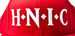
Police identifiée : Gotham Rounded

Police identifiée : Caecilia
Police identifiée : Typonome

Police identifiée : RP Mola


Either the designer made a new font with the Cap M and B - or someone modified them ..but the rest is all Chicago House.
Police identifiée : Chicago House

Police identifiée : Beau Sans
Fuseau horaire : CEST. Il est actuellement 17:05
