Forum
2 posts
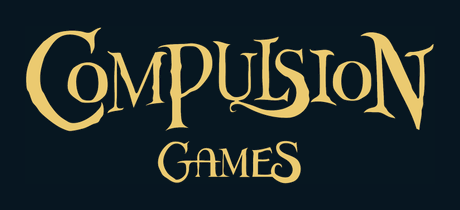
Compulsion Games
Hey there!
I was curious myself and did as much digging as I could. From what I can tell, there is no direct matching font publicly available.
Given that Compulsion Games was a small independent studio before being acquired by Microsoft they likely didn't have the discretionary money to consider aesthetic choices to the extent of buying the rights to a font with the tighter budget. With this, and the fact that the only files I can dig up around the internet are vectors or pngs I think there are either 2 explanations
1. Their logo was created in-house by an artist on staff and the font does not exist outside of the logo.
2. This is a proprietary font that has not been released outside of the company
Due to interactions on their website and other online properties, I say that explanation 1 is more likely. This explanation also accounts for smaller inconsistencies within the logo such as the tails on the letter "s".
It stinks though, I really wanted to use a similar font. The closest you will get aesthetically is either Zephyr-regular by International House of Fonts. or NREY/Andriy Dykun's Walpurgis Night Regular.
Suggested font: Zephyr
All times are CEST. The time is now 17:39


