Forum
8 posts
Font name please?
Suggested fonts
Benton Sans Black Suggested by donshottype
Helvetica Black Suggested by DimensionPizza
Helvetica Neue Heavy Suggested by DimensionPizza
Arial Bold Suggested by myname5749
Suggested font: Arial Bold
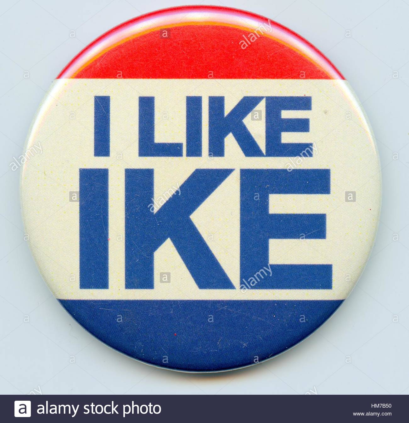
Hand lettered.
Note that repeating letters _K_ and _E_ do not match.
Closest I found in a font to approximate I LIKE IKE is Benton Sans Black.
Note that the center stroke on _E_ is too short.
Franklin Gothic is also in the ballpark, but not as close.
Edited on Feb 10, 2018 at 21:31 by donshottype
Note that repeating letters _K_ and _E_ do not match.
Closest I found in a font to approximate I LIKE IKE is Benton Sans Black.
Note that the center stroke on _E_ is too short.
Franklin Gothic is also in the ballpark, but not as close.
Suggested font: Benton Sans Black
Edited on Feb 10, 2018 at 21:31 by donshottype
Suggested font: Helvetica Black
Helvetica is also close but weight is wrong. Need something between Bold and Black to be a good substitute.
Edited on Feb 11, 2018 at 12:01 by donshottype
Edited on Feb 11, 2018 at 12:01 by donshottype
This should be good.
Suggested font: Helvetica Neue Heavy
If I recall correctly the I LIKE IKE button was from the 1952 election.
Helvetica was designed in 1957 and did not offer a weight between bold and black, i.e. heavy.
Helvetica Neue Heavy [suggested by DimensionPizza] seems to be your best choice to recreate something close to the hand lettered I LIKE IKE.
Here is Helvetica Neue Heavy, with I LIKE scaled to 50% of IKE:

Helvetica was designed in 1957 and did not offer a weight between bold and black, i.e. heavy.
Helvetica Neue Heavy [suggested by DimensionPizza] seems to be your best choice to recreate something close to the hand lettered I LIKE IKE.
Here is Helvetica Neue Heavy, with I LIKE scaled to 50% of IKE:

Thank you for all the reponse. I finally used Helvetica and it looks ok.
All times are CEST. The time is now 08:38


