English
Français
Español
Deutsch
Italiano
Português
Login
|
Register
Themes
New fonts
Authors
Top
Forum
FAQ
Submit a font
Tools
Forum
Newer Topic
Older Topic
Forum
→
Font identification
→
Back to the list
1 post
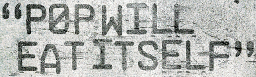
Pop Will Eat Itself font
#1
Shuriken76
Quote
Jul 27, 2011 at 21:02
Any ideas? I think some of the distortion is by the designers but the duplicated lines under the L and E suggests some of the grungyness is a feature of the font itself. Hope you guys can help!
All times are CEST. The time is now 21:01
Reply
Newer Topic
Older Topic
Forum
→
Font identification
→
Back to the list
Privacy Policy
-
Contact