
 English
  Français
  Español
  Deutsch
  Italiano
  Português
Foro
20 posts Fuentes identificadas Sólo solicitudes
Posts de DCxDemo

jerseygirl ha dicho 
Serpentine Sans
i disagree, T C and S clearly have diagonal cuts, while the accepted sans version doesnt.

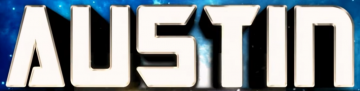
This is Nasalization Bold.
Be aware online previews generate straight Ms, but the font itself has several oblique versions of W and M as seen on the logo here.
Be aware online previews generate straight Ms, but the font itself has several oblique versions of W and M as seen on the logo here.
Fuente identificada: Nasalization Bold
this is based on the transformers font, but i didnt find any that match all glyphs at the same time.
Robofan, Cybertron, Optimus, Transrobotics
Editado 4 veces. Última edición el 20/10/2023 a las 04:25 por frd
Robofan, Cybertron, Optimus, Transrobotics
Fuente sugerida: Robofan
Editado 4 veces. Última edición el 20/10/2023 a las 04:25 por frd



There is a user thread on the stopgame website about the font, they suggested Ginza Narrow Heavy Oblique could be used as a source.
Editado el 19/10/2023 a las 23:12 por jerseygirl
Fuente sugerida: Ginza
Editado el 19/10/2023 a las 23:12 por jerseygirl

Just realized this is Doom menu font.
https://i.imgur.com/pfLkfUN.png
While no official source font exist, there are recreations.
https://i.imgur.com/pfLkfUN.png
While no official source font exist, there are recreations.
Fuente identificada: Doom


Ritafurey Bold Italic by Linotype, lowercase n used on the logo.
Fuente sugerida: Ritafurey Bold Italic

Fuente identificada: Benguiat
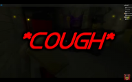

Fuente identificada: Ethnocentric Bold

Very small sample to be sure, but it's Some Agency FB variant, probably Condensed Bold.
Fuente identificada: Agency Condensed Bold


Fuente identificada: London Seventy Six Fall


oh that sure helped. "I don't understand", "we don't care" - you are the essence of helpfulness, sir.
then delete it, it's useless now.
"blurry things" contained hints on what i'm looking for and you actually resized a resized image, even though original image was included there. what a good job you did. right on.
Editado el 05/08/2018 a las 15:01 por DCxDemo
"blurry things" contained hints on what i'm looking for and you actually resized a resized image, even though original image was included there. what a good job you did. right on.
Editado el 05/08/2018 a las 15:01 por DCxDemo

Editado 4 veces. Última edición el 05/08/2018 a las 14:59 por DCxDemo
Huso horario CEST. Ahora son las 06:40
