
Foro
23 posts
Posts de ellenelle
Thanks.
For the moment, since I am not skilled at hinting, to say the least, I am very happy to have discovered these autohinting utilities: http://www.freetype.org/ttfautohint/ and http://www.fontsquirrel.com/tools/webfont-generator .
For the moment, since I am not skilled at hinting, to say the least, I am very happy to have discovered these autohinting utilities: http://www.freetype.org/ttfautohint/ and http://www.fontsquirrel.com/tools/webfont-generator .
Not easily fixed, then. But is hinting responsible for the spacing issue? It seems to be different. Take a look at at the fonts I mentioned, for example, University Roman LET; the spacing is way off even when the letters themselves are acceptable, all the way to 14 pt.
I appreciate the discussion. Now back to my question:
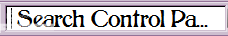
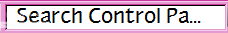
From now on, I will be more specific, for everyone's sake. To reveal my very trivial concerns, I like to substitute fonts in the registry for MS Shell Dlg and MS Shell Dlg 2, which are used in most system dialog boxes at 9 pt, and you can't change the size, you can only change the font. I do this for reasons of aesthetics and legibility the latter because it is difficult for me to read at a very small pt size. If you substitute a font that shows larger than the default at 9 pt, you get a more legible dialog box.
So for this purpose, I'm concerned only with the way the font appears on the screen. I look for fonts that look relatively large at 9 pt. But at that size, some fonts display weirdness in spacing, like the ones I mentioned. Other fonts display inconsistency in the sizing; an example of this would be Moderna Unicase Medium (free at MyFonts).
This is for my own personal use, so I'd like to know if there is some way I can tinker with fonts that have this problem so that I might improve the look of things on screen. I use TypeTool and am fairly inexperienced, but I am learning.
Wow, the moral authority has spoken.
Anyway, most of the fonts that come with Windows 7 that have LET after their names (foundry, Altsys) have this problem.
Anyway, most of the fonts that come with Windows 7 that have LET after their names (foundry, Altsys) have this problem.
What might cause a font to display onscreen with erratic spacing at different sizes (but normal when printing)? This happens typically at small sizes, but not always.
I'm not talking about poor resolution, just changes in spacing. Is there some way to fix a font that does something like this?
Thanks,
Ellen
I'm not talking about poor resolution, just changes in spacing. Is there some way to fix a font that does something like this?
Thanks,
Ellen
Claude,
Thanks for your suggestions! It's much better now. I have to play around a little bit more, but it is probably some combination of the two.
Thanks for your suggestions! It's much better now. I have to play around a little bit more, but it is probably some combination of the two.
OK, thanks, but when I increase the line gap value, nothing changes.
It is not as simple as just finding the phrase in the manual, unfortunately. I looked in the chapter "Vertical Metrics" and there is nothing in there that refers to "line gap." Where the phrase does occur, there is no indication on how to adjust it. TypeTool is not a professional program and it may be the case that it doesn't allow adjustment of the line gap. There are other things I've looked to do with it that it doesn't do. Unless anyone has another idea, I suppose I will have to contact the manufacturer.
As far as finding another font, I have a lot of themes that I've made with other fonts, but this is a font that I really like and I want to use it.
As far as finding another font, I have a lot of themes that I've made with other fonts, but this is a font that I really like and I want to use it.
I still have no idea what I might do. Could somebody please explain a little? I'm basically a dabbler/neophyte with eye problems that make it difficult for me to search for a potential answer through a 376 page manual.
What are line gap settings? It sounds like something that could affect what I'm talking about.
On my pc, a theme for windows.
I'm just using it in a theme at the moment.
You mean which font editor? TypeTool.
Thanks.
So, here's an example where the font is used in a Windows theme. Notice how the first font is centered vertically, while the second shot, showing Myndraine, is too high. There must be some term for this, but I don't know it.
So, here's an example where the font is used in a Windows theme. Notice how the first font is centered vertically, while the second shot, showing Myndraine, is too high. There must be some term for this, but I don't know it.


That really does not explain what I'm seeing. It would be good if I could post a screenshot or something, but I see nothing that allows me to do that. How can I attach a graphic file?
Can anyone tell me why the font Myndraine appears higher above the baseline than other fonts, and how that might be fixed? I opened it in a font editor and it looked like any other font to me, but I'm not very experienced.
Thanks,
Ellen
Thanks,
Ellen
Hey bito, it worked! Thanks so much for that esoteric advice, and also the information about embedding.
Ellen
Ellen
I'm not sure I completely understand what you're saying. Do I need to delete any documents in Word that use Myndraine? I couldn't just change the fonts temporarily? I have already uninstalled the TTF version -- is that not going far enough?
I have some PSP files that use Myndraine, which were created in Paint Shop Pro and would be just too time-consuming to mess with, but I doubt those would have any systemic impact on my computer.
Thanks,
Ellen
I have some PSP files that use Myndraine, which were created in Paint Shop Pro and would be just too time-consuming to mess with, but I doubt those would have any systemic impact on my computer.
Thanks,
Ellen
I have tried it in Paint Shop Pro and Word, on my XP computer. Again, never had any problems like this before whether TrueType or Open Type.
bobistheowl, I did as you suggested, but mystifyingly, I am still having the same problem.
Any other thoughts?
Thanks,
Ellen
bobistheowl, I did as you suggested, but mystifyingly, I am still having the same problem.
Any other thoughts?
Thanks,
Ellen
I'm trying to use the font Myndraine, but it won't respond to the normal things one does to make a font bold (by selecting text and clicking on the bold button). I am however able to make it italic. This is the first time I've ever encountered this problem with any font, including fonts that don't come with bold and italic versions.
Can anyone tell me why this might be happening and how to get this font to work on my computer?
Thanks,
Ellen
Can anyone tell me why this might be happening and how to get this font to work on my computer?
Thanks,
Ellen
Huso horario CEST. Ahora son las 09:03
