Foro
4 posts
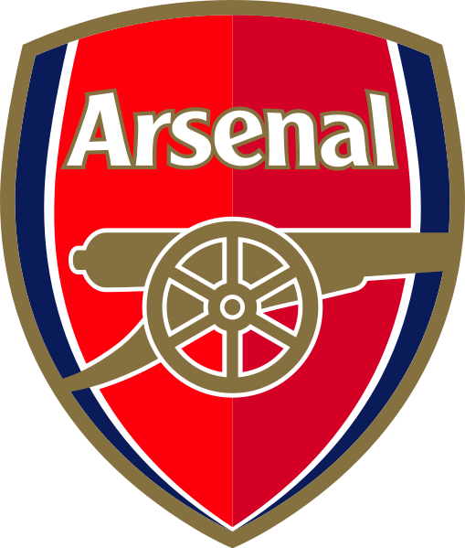
Arsenal Font? Pleasee
Fuente identificada: Clearface Gothic Medium
The letters are Clearface Medium - and have been placed on an angle which is why the "l" looks a bit distorted.
Absolutely nothing to do with Clearface, sorry. It's Clear Gothic - bold.
Editado el 26/09/2013 a las 17:33 por daveliso
Editado el 26/09/2013 a las 17:33 por daveliso
Huso horario CET. Ahora son las 07:40


