
Forum
13.711 posts Identifizierte Fonts
Posts von koeiekat


Identifizierter Font: Markus Ink

The image is sort of not very clear but maybe the Geometric Slabserif Extra Bold?
Vorgeschlagener Font: Geometric Slabserif Extra Bold

Step too.

Identifizierter Font: Strangelove Text

Identifizierter Font: Jokerman
The whole logotype is based on the Avant Garde but totally modified.
Too small and too little contrast.
Do you have something readable?
mumble ... mcards.com is for sale ...
Looks like a mix of the Tzaristane Normal and Oblique. Ampersand slightly modified for this logotype.
Vorgeschlagener Font: Tzaristane


Identifizierter Font: Usuzi
Welcome ... as always 


Identifizierter Font: Despeinada

Try (New) Century Schoolbook, sample stretched to 200%.
Bearbeitet 2 mal. Zuletzt bearbeitet am 16.09.2011 um 12:32 von vinz
Identifizierter Font: Century Schoolbook
Bearbeitet 2 mal. Zuletzt bearbeitet am 16.09.2011 um 12:32 von vinz


Identifizierter Font: Luna Bar
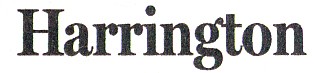
Identifizierter Font: Miller Headline - Bold
digital ...
Alle Zeitangaben sind CEST. Es ist jetzt 10:23
