
Forum
62 posts Identifizierte Fonts Nur Anfragen
Posts von moviefan2k4
I haven't bumped this up in quite some time; does anyone know of a match for this logo?
Its not Bee Three, because that font has sharper slants on the capital S's. Also, there isn't one all-inclusive font for every movie poster. There's a few different ones that seem to be used by various studios, though (Univers for Universal Pictures being one example).

I did some research, and it seems that both Gamer and Cornered were patterned after a 1970s font prototype called Checkmate. There is another similar one called Chisel, but the characters are often wider than the actual "Escape" logo.
So, to put it simply, there is no 100% match, but Gamer and Cornered will get you the closest.
So, to put it simply, there is no 100% match, but Gamer and Cornered will get you the closest.
Vorgeschlagener Font: Checkmate
I couldn't find a hi-res version of the original film's poster online, so I'm sorry for the low quality of this image. But if anyone could help me figure out what font was used, I'd appreciate it. Thanks.
Its not Univers, because the capital S's have different center angles. Its also not SF Movie Poster, since the capital M's touch the baseline. Bee Two seems the most likely, as was previously mentioned.
Does anyone know what typeface was used, for the logo on this movie's 25th-anniversary home video release? I'd appreciate all the help I can get; thanks.

What typeface is used for these titles? I know for a fact it is NOT the Matrix fan font, nor the similar one called Miltown. So if anyone knows the actual font used for these, I'd appreciate it. Thanks.

The title looks very similar to Century, but the capital O is too wide in that font.
Bebas Neue is too tall and thin for the top font; thanks for the suggestion though.
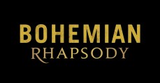
I'm wondering which two fonts are used in this movie's logo, especially the one for "Rhapsody". If anyone can help me out, I'd appreciate it. Thanks.
I don't think it is a font; the logo was originally designed in 1987 for the cartoon series. The font called "Turtles" was inspired by the bottom half, but it came along much later.

The "studios" one is actually Kenyan Coffee Regular. Dharma Gothic is close, but the characters are a little too tall compared to their width.
Vorgeschlagener Font: Kenyan Coffee

Its Bank Gothic, except for the Avengers symbol in "More Than A Hero".
Identifizierter Font: Bank Gothic
Its very similar, but there's one important difference: none of the letters in the Growing Pains logo have any serifs.
Any guesses, as to what font was used for this? Thanks in advance!

Bearbeitet am 18.03.2018 um 12:02 von marty666
Bearbeitet am 18.03.2018 um 12:02 von marty666
Does anyone know which typefaces were used, for the individual film titles on these movies? I'd greatly appreciate any help you could be; thanks.

Still looking - can anyone help me with this?
jerseygirl sagte 
New Century Schoolbook Bold
New Century Schoolbook wasn't created until 2007, and this image comes from 1984. I already said the original version of Century Schoolbook wasn't a match anyway.
This font is very similar to Clarendon, News 701, and Century Schoolbook, but I can't find an exact match. If anyone can help me with this, I'd appreciate it. Thanks. 

Bearbeitet am 24.02.2018 um 00:38 von moviefan2k4

Bearbeitet am 24.02.2018 um 00:38 von moviefan2k4
This typeface appears very similar to Trajan Bold, but the M is far too wide. Any help would be appreciated; thanks!

Alle Zeitangaben sind CEST. Es ist jetzt 00:08
