
Forum
1.702 identifizierter fonts Alle Beiträge Nur Anfragen
Identifizierte Fonts von sjh


I did a vertical compress of about 40%, which rounded out the Q and the C, and revealed Code Light.
Identifizierter Font: Code

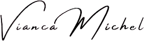
Identifizierter Font: Freshmade Signature
Identifizierter Font: Amsterdam Four


Many of the glyphs are alternates from the typeface. You can see them at the MyFonts tester under the ff menu: choose Swash.
Identifizierter Font: Oldskool Script

Looks like Eurostile Medium for the larger caps. Hard to see for the smaller lower case text.
Bearbeitet am 17.04.2024 um 03:28 von frd
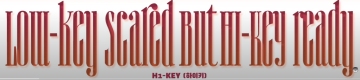
Identifizierter Font: Eurostile
Bearbeitet am 17.04.2024 um 03:28 von frd
Identifizierter Font: Quinn
Same church, different pew.
https://www.1001fonts.com/semplicita-font.html
Bearbeitet am 17.04.2024 um 03:15 von frd
https://www.1001fonts.com/semplicita-font.html
Bearbeitet am 17.04.2024 um 03:15 von frd

All but the T and the E are from Organo. Maybe they came from Arista (Billy Argel), a similar typeface.
Identifizierter Font: Organo

I think it is MuseoModerno, Medium weight, but slanted by the designer to get the g in your sample. MuseoMonerno Italic has a fancier small g.
Identifizierter Font: MuseoModerno


Identifizierter Font: Days One

Identifizierter Font: Avigea

Identifizierter Font: Blessed Day

Identifizierter Font: Baroneys

Identifizierter Font: Stockport Brush

Alle Zeitangaben sind CEST. Es ist jetzt 09:47
