
Forum
6.104 identifizierter fonts Alle Beiträge Nur Anfragen
Identifizierte Fonts von Heron2001


Identifizierter Font: Deko Display Serial Bold
Identifizierter Font: Antique Olive


Identifizierter Font: Cocogoose

Identifizierter Font: Code Next Bold

Identifizierter Font: Times

Identifizierter Font: Neometric Alt Heavy
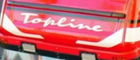
Identifizierter Font: 911 Porscha

Identifizierter Font: Kaftan Serif

Identifizierter Font: Master Of Break

Identifizierter Font: Losta Masta

Identifizierter Font: Signkit Script

It was set in all lower case and I am sorry, I cannot find you a legit link.
Identifizierter Font: TTG Bold

Identifizierter Font: Lovely

Identifizierter Font: HuckelBerry

Identifizierter Font: Gunship
Alle Zeitangaben sind CEST. Es ist jetzt 09:53
