
Forum
17 posts
Help?
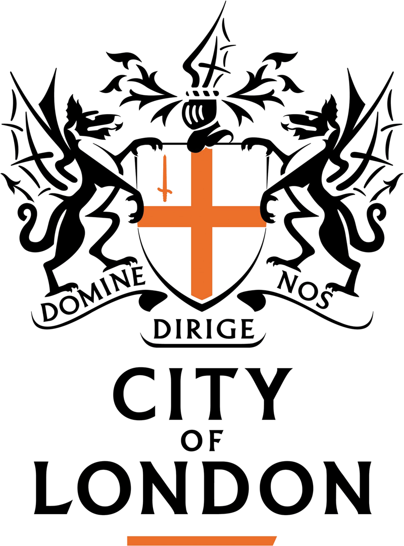
Identifizierter Font
Albertus Vorgeschlagen von Heron2001
Vorgeschlagener Font
Holland Vorgeschlagen von fmontpetit

Close. Maybe based on it.
Vorgeschlagener Font: Holland

Never heard of "Holland" - but only knew it as Albertus over the years....
Identifizierter Font: Albertus
I didn't know about Holland either but I just though it was closer than Albertus. Still not an exact match.
Other versions of Albertus: Adelon Serial, Flair Serif 821.
Holland has more difference IMO.
Other versions of Albertus: Adelon Serial, Flair Serif 821.
Holland has more difference IMO.
And don't forget for the ExtraBold - we used Anthony... lol
Didn't know that. See, that's why I love hanging with you guys. I learn something every time. 


Red wine? Now you're talking, Jackie!
Bearbeitet am 13.10.2012 um 16:09 von fmontpetit
Bearbeitet am 13.10.2012 um 16:09 von fmontpetit
Every night with dinner.... and maybe some wonderful cheese and crackers... I asked for the wine clinkers back, we use to have them - I won't touch beer!

Heron2001 sagte 
Never heard of "Holland" - but only knew it as Albertus over the years....
Albertus
Albertus
http://en.wikipedia.org/wiki/Albertus_%28typeface%29
"Albertus is used for the street name signs in the City of London, City of London Corporation and London Borough of Lambeth."

Special: the second M

Thanks everybody 


I'm guessing that the 'D' has had some tinkering for the OPs sample of the City o' London crest since this is not a match to Albertus. My best guess is that whoever created this vector, stylised version has played fast and loose with the actual font in doing so.
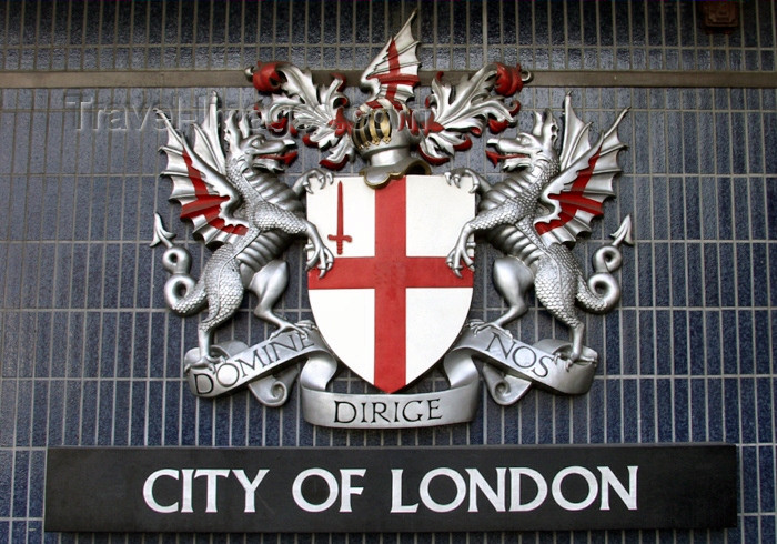
Thank you! Now THAT is Albertus!
fmontpetit sagte
Thank you! Now THAT is Albertus!
It will be that, the GD who created the vector had a copy of Holland Title et al, but not Albertus and thought "no one will ever notice". Little did they imagine the scrutiny their work would come under, right here. Poor soul.

Yes, here we look at every detail until the font cries... 

I took a look at a pdf from their web site. They use OP's sample as a logo. But on the same page there is another logo, "safercity" that use Albertus for the "City of London" copy underneath. So I guess the logo is officially a modified Albertus and they will use the original typeface when needed elsewhere.
Bearbeitet am 13.10.2012 um 21:31 von fmontpetit
Bearbeitet am 13.10.2012 um 21:31 von fmontpetit
Alle Zeitangaben sind CEST. Es ist jetzt 01:14
