
Forum
42 posts
Can someone help refine this font I'm working on?
Hello, everyone! ^_^ This is my very first post here, & I wish to ask all of you a question. Let me begin by saying that I've nearly completed a font I made based on the logo font on this poster:
https://i0.wp.com/nostalgiavideo.net/wp-content/uploads/2022/02/The_Great_Mouse_Detective_August_21_1992_VHS.jpg?fit=1487%2C2508&ssl=1
But here's the issue at hand: if I'm not imposing, would someone be gracious enough to refine all of the letters, numbers, & symbols in my font? You see, I started doing it myself, but after fixing up the capital A & B letters, I had to stop myself from continuing any further. The reason for this is that I have INSANE O.C.D., & I would spend *SO MUCH TIME* trying to fix every single tiny imperfection in each of the font's characters, when I have so many other things to do. I think a helpful volunteer would be able to refine all of the imperfections of said characters in a much-more-efficient & timely manner.
So, if anyone would like to help work on this font for me, here's the original TTF file:
https://drive.google.com/file/d/1Ck7ZIWTYYlqSeqtoES_6FZFbywTqJcQU/view?usp=share_link
And if any of you have FontForge, here's the link to the SFD:
https://drive.google.com/file/d/1orxtvP9q-EBBnnirM3KRNP4UsuV_4liE/view?usp=share_link
Any assistance would be greatly, GREATLY appreciated! ^_^ Thanks in advance!
I really, really do hope I'm not imposing by asking this.

Hi,
You should probably specify your budget if you expect an answer.
But first, are you sure you're not trying to reproduce an existing font?
This poster was declined in English, French and other languages, so I'm pretty sure it was made from a font.
Bearbeitet am 20.01.2023 um 17:40 von marty666
You should probably specify your budget if you expect an answer.
But first, are you sure you're not trying to reproduce an existing font?
This poster was declined in English, French and other languages, so I'm pretty sure it was made from a font.
Bearbeitet am 20.01.2023 um 17:40 von marty666
marty666 sagte 
Hi,
You should probably specify your budget if you expect an answer.
You should probably specify your budget if you expect an answer.
I don't want to ask for too little or too much, so I'll say...perhaps $25 would do.
marty666 sagte
Hi,
But first, are you sure you're not trying to reproduce an existing font?
This poster was declined in English, French and other languages, so I'm pretty sure it was made from a font.
But first, are you sure you're not trying to reproduce an existing font?
This poster was declined in English, French and other languages, so I'm pretty sure it was made from a font.
If it was a font, it was made especially for the movie poster; I haven't been able to find anything like it online anywhere.
Do these answer your questions? :-)

It's too much work....
Duplicated knots Glyph index 4
Misoriented contour Glyph index 4
Not all extremes are marked with the on-curve control points Glyph index 5
Duplicated knots Glyph index 5
Intersecting contours Glyph index 5
Unable to perform test due to previously detected errors Glyph index 5 Test: ValidateSimpContMisor
Not all extremes are marked with the on-curve control points Glyph index 6
Duplicated knots Glyph index 6
Misoriented contour Glyph index 6
Duplicated knots Glyph index 7
Misoriented contour Glyph index 7
Duplicated knots Glyph index 8
Misoriented contour Glyph index 8
Duplicated knots Glyph index 9
Misoriented contour Glyph index 9
Duplicated knots Glyph index 10
Intersecting contours Glyph index 10
Unable to perform test due to previously detected errors Glyph index 10 Test: ValidateSimpContMisor
Not all extremes are marked with the on-curve control points Glyph index 11
Misoriented contour Glyph index 12
Duplicated knots Glyph index 13
Duplicated knots Glyph index 14
Duplicated knots Glyph index 15
ntersecting contours Glyph index 15
Unable to perform test due to previously detected errors Glyph index 15 Test: ValidateSimpContMisor
Not all extremes are marked with the on-curve control points Glyph index 16
Duplicated knots Glyph index 16
Misoriented contour Glyph index 17
Not all extremes are marked with the on-curve control points Glyph index 18
Duplicated knots Glyph index 18
Misoriented contour Glyph index 19
Duplicated knots Glyph index 20
Misoriented contour Glyph index 20
etc....
claudeserieux sagte
It's too much work....
Duplicated knots Glyph index 4
Misoriented contour Glyph index 4
Not all extremes are marked with the on-curve control points Glyph index 5
Duplicated knots Glyph index 5
Intersecting contours Glyph index 5
Unable to perform test due to previously detected errors Glyph index 5 Test: ValidateSimpContMisor
Not all extremes are marked with the on-curve control points Glyph index 6
Duplicated knots Glyph index 6
Misoriented contour Glyph index 6
Duplicated knots Glyph index 7
Misoriented contour Glyph index 7
Duplicated knots Glyph index 8
Misoriented contour Glyph index 8
Duplicated knots Glyph index 9
Misoriented contour Glyph index 9
Duplicated knots Glyph index 10
Intersecting contours Glyph index 10
Unable to perform test due to previously detected errors Glyph index 10 Test: ValidateSimpContMisor
Not all extremes are marked with the on-curve control points Glyph index 11
Misoriented contour Glyph index 12
Duplicated knots Glyph index 13
Duplicated knots Glyph index 14
Duplicated knots Glyph index 15
ntersecting contours Glyph index 15
Unable to perform test due to previously detected errors Glyph index 15 Test: ValidateSimpContMisor
Not all extremes are marked with the on-curve control points Glyph index 16
Duplicated knots Glyph index 16
Misoriented contour Glyph index 17
Not all extremes are marked with the on-curve control points Glyph index 18
Duplicated knots Glyph index 18
Misoriented contour Glyph index 19
Duplicated knots Glyph index 20
Misoriented contour Glyph index 20
etc....
Duplicated knots Glyph index 4
Misoriented contour Glyph index 4
Not all extremes are marked with the on-curve control points Glyph index 5
Duplicated knots Glyph index 5
Intersecting contours Glyph index 5
Unable to perform test due to previously detected errors Glyph index 5 Test: ValidateSimpContMisor
Not all extremes are marked with the on-curve control points Glyph index 6
Duplicated knots Glyph index 6
Misoriented contour Glyph index 6
Duplicated knots Glyph index 7
Misoriented contour Glyph index 7
Duplicated knots Glyph index 8
Misoriented contour Glyph index 8
Duplicated knots Glyph index 9
Misoriented contour Glyph index 9
Duplicated knots Glyph index 10
Intersecting contours Glyph index 10
Unable to perform test due to previously detected errors Glyph index 10 Test: ValidateSimpContMisor
Not all extremes are marked with the on-curve control points Glyph index 11
Misoriented contour Glyph index 12
Duplicated knots Glyph index 13
Duplicated knots Glyph index 14
Duplicated knots Glyph index 15
ntersecting contours Glyph index 15
Unable to perform test due to previously detected errors Glyph index 15 Test: ValidateSimpContMisor
Not all extremes are marked with the on-curve control points Glyph index 16
Duplicated knots Glyph index 16
Misoriented contour Glyph index 17
Not all extremes are marked with the on-curve control points Glyph index 18
Duplicated knots Glyph index 18
Misoriented contour Glyph index 19
Duplicated knots Glyph index 20
Misoriented contour Glyph index 20
etc....
Wait...What in the WORLD does all that mean?!
Maybe, it means I should simplify all the characters first? Perhaps, that's what's causing the problem. Let me try it, & re-upload the font; it might be much easier work then. :-) It shouldn't take very long.
Bearbeitet am 21.01.2023 um 21:53 von The Mouse Avenger
Don't drag me into this.
(J'aurai du ne pas répondre à ça.)

(J'aurai du ne pas répondre à ça.)
claudeserieux sagte
Don't drag me into this.
(J'aurai du ne pas répondre à ça.)
(J'aurai du ne pas répondre à ça.)
(looks at the picture) Yes, I definitely need to simplify. But you do not necessarily have to do this, if you really don't want to. :-) Other people are perfectly free to take up my "challenge".

The Mouse Avenger sagte
(looks at the picture) Yes, I definitely need to simplify. But you do not necessarily have to do this, if you really don't want to. :-) Other people are perfectly free to take up my "challenge".
I am surprised to hear/read that from a self-confessed OCD. You should live up to being OCD and go for perfection.


@The Mouse Avenger: The text in that poster is custom lettering, as opposed to a font, ie: Someone drew the letters as part of the picture. The R and A in Great are connected, but not all of the capitals have connections. The curved angle would be different if there were more or fewer than two letters in between.
metaphasebrothel sagte
@The Mouse Avenger: The text in that poster is custom lettering, as opposed to a font, ie: Someone drew the letters as part of the picture. The R and A in Great are connected, but not all of the capitals have connections. The curved angle would be different if there were more or fewer than two letters in between.
I think I can fix that, or achieve a similar result, with kerning. :-) I'm more concerned about having those tiny little imperfections fixed. Alas, I'm trying to simplify the font first before I reupload it for you guys, but so far, the characters get all messed up when I try to delete or merge extraneous nodes. Any suggestions?
toto@k22 sagte
The Mouse Avenger sagte
(looks at the picture) Yes, I definitely need to simplify. But you do not necessarily have to do this, if you really don't want to. :-) Other people are perfectly free to take up my "challenge".
I am surprised to hear/read that from a self-confessed OCD. You should live up to being OCD and go for perfection.
I would in this particular case, were I not busy with so many creative projects. ^^;; Part of my New Year's Resolution is to get a certain number of those projects done -- writing & publishing children's books, publishing a poetry book, completing scripts for an epic miniseries sequel to "The Great Mouse Detective" & a third sequel to "The Rescuers", composing all of the songs for said films, & composing a few original compositions, along with some little side tasks. :-) I'm making good progress on the first task so far! ^_^
Anyway, that's why I'm asking for help in refining my font. To do so myself would take up too much precious time that I need to focus on my major projects. And, of course, if anyone wishes to offer their assistance, that would be greatly, GREATLY appreciated! :-)
claudeserieux sagte
Thanks for the tip! ^_^ I'll try that.
The Mouse Avenger sagte
claudeserieux sagte
Thanks for the tip! ^_^ I'll try that.
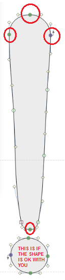
IMO you should only retain the nodes circled in red and scrap all other nodes. Adjust the BCPs of the nodes on the sides and bottom to get the shape that you want. Retaining the two nodes on the sides next to the bottom node would be fine as well but I think you can achieve that shape with just four nodes.
BTW forgot the OK r fine in the label inside the circle
Toto, il ne peut pas enlever les autres points car il est en Truetype. Je voulais qu'il enlève ses points double.( Duplicated knots )
claudeserieux sagte
Toto, il ne peut pas enlever les autres points car il est en Truetype. Je voulais qu'il enlève ses points double.( Duplicated knots )
Thanks for the tip! ^_^ I tried simplifying the exclamation point, & now, it looks SPLENDID!
 I'm gonna do the same thing with the other characters in the font, & hopefully, they'll come out looking as perfect as I want them to be! ^_^
In the meantime, though, there's a teeny, tiny little problem: After working on fixing my "exclamation point" character, the vertical bar on top disappeared in the preview window, & I don't even know what I did wrong to make that happen. :-( So...could someone help me with that? :-)
Here's the EPS file of the exclamation point character:
https://drive.google.com/file/d/1OlEFKIlsyPFYOTl3ArluFRib0XLFwRBJ/view?usp=share_link
And here's a visual summation of my vexing little problem:
https://i.ibb.co/HBKn1B5/Oopsie.png
Il y a 2 façon de dessiner. (PostScript curves and TrueType curves)
Pour moi, je dessine en PS et a la fin je génère une Truetype.

Pour moi, je dessine en PS et a la fin je génère une Truetype.
The Mouse Avenger sagte
In the meantime, though, there's a teeny, tiny little problem: After working on fixing my "exclamation point" character, the vertical bar on top disappeared in the preview window, & I don't even know what I did wrong to make that happen. :-( So...could someone help me with that? :-)
It is not close.
claudeserieux sagte
The Mouse Avenger sagte
In the meantime, though, there's a teeny, tiny little problem: After working on fixing my "exclamation point" character, the vertical bar on top disappeared in the preview window, & I don't even know what I did wrong to make that happen. :-( So...could someone help me with that? :-)
It is not close.
Where is it not closed, exactly? I can't tell.
Alle Zeitangaben sind CET. Es ist jetzt 18:55
