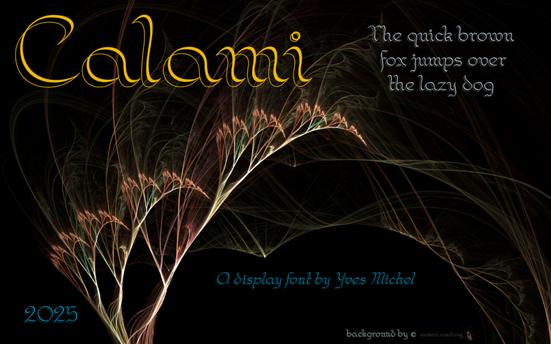
Calami
133 downloads Free for personal use - 2 font files
Calami-Regular.ttfCalami-Italic.ttfNote of the author
La police est inspirée d'un exercice contenu dans 'The Zanerian Manual of Alphabets and Engrossing", ouvrage lui-même digitalisé par David Grimes (https://masgrimes.com/)
Je l'ai scannée et digitalisée puis redressée à partir d'un italique négatif.
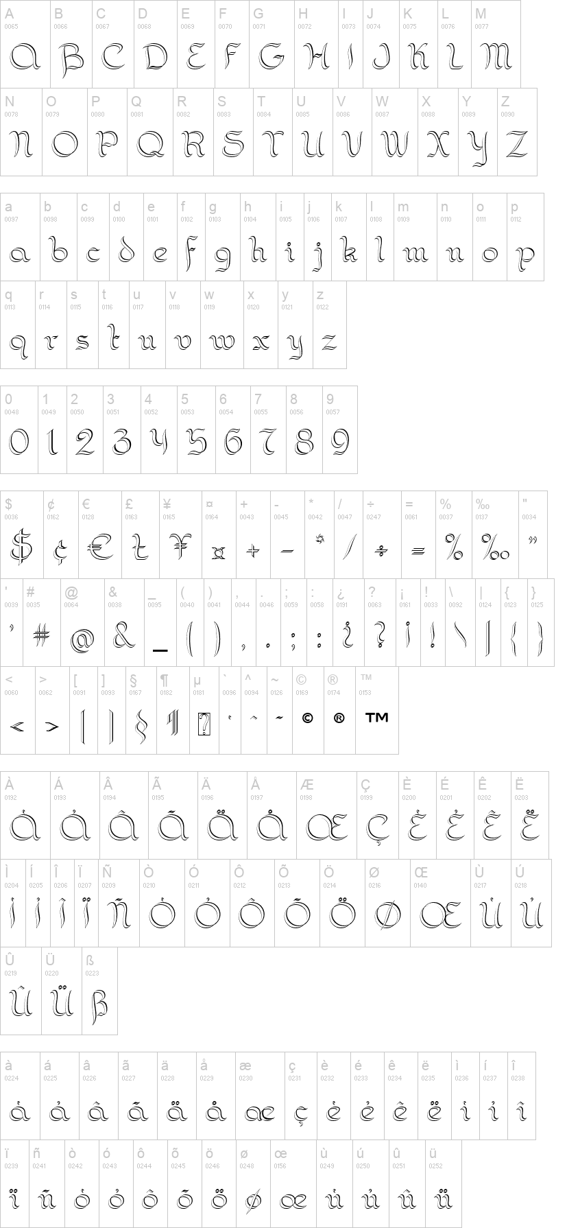
Il s'agit d'une police calligraphiée avec une plume à double pointe (fine à gauche, large à droite), du type "Scroll Nibs 10" de William Mitchell Ltd, "Twin Nib" de Kaweco ou "Twin Italic point" de Bock.
___________________________________________________________
This font is inspired by an exercise in penmanship from "The Zanerian Manual of Alphabets and Engrossing", book digitized by David Grimes (https://masgrimes.com/)
I scanned and digitized it and transformed it from back italic to regular.
It' a calligraphic font made with a double-pointed pen (light on the left and broad on the right), like the "Scroll Nibs 10" from William Mitchell Ltd, "Twin Nib" from Kaweco ou "Twin Italic point" from Bock.
Je l'ai scannée et digitalisée puis redressée à partir d'un italique négatif.
Il s'agit d'une police calligraphiée avec une plume à double pointe (fine à gauche, large à droite), du type "Scroll Nibs 10" de William Mitchell Ltd, "Twin Nib" de Kaweco ou "Twin Italic point" de Bock.
___________________________________________________________
This font is inspired by an exercise in penmanship from "The Zanerian Manual of Alphabets and Engrossing", book digitized by David Grimes (https://masgrimes.com/)
I scanned and digitized it and transformed it from back italic to regular.
It' a calligraphic font made with a double-pointed pen (light on the left and broad on the right), like the "Scroll Nibs 10" from William Mitchell Ltd, "Twin Nib" from Kaweco ou "Twin Italic point" from Bock.
First seen on DaFont: July 30, 2025