

Fórum
4.435 posts Fontes identificadas Apenas pedidos
Posts por pilaster


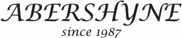
Lobster Two
Editado 2 vezes. Última ediçăo em 19/04/2012 ŕs 10:52 por pilaster
Fonte identificada: Lobster Two
Editado 2 vezes. Última ediçăo em 19/04/2012 ŕs 10:52 por pilaster

Looks like Optima (demi bold or bold)?
Editado 2 vezes. Última ediçăo em 19/04/2012 ŕs 01:14 por pilaster
Fonte identificada: Optima
Editado 2 vezes. Última ediçăo em 19/04/2012 ŕs 01:14 por pilaster
No offence intended. The Fire and the dog are warm and the beer is cold, and here, it's late.
Er... should I mention warp or type on paths and upper and lowercase type in the font...or should I go back to my beer in front of the fire with my dog?

Looks like Helvetica Bold tho' a bit fuzzy.
Editado em 19/04/2012 ŕs 09:31 por drf_
Fonte sugerida: Helvetica Bold
Editado em 19/04/2012 ŕs 09:31 por drf_

THE TING TINGS looks like
Futura Std Extra Bold Condensed Oblique
We started etc. all looks hand drawn.
Futura Std Extra Bold Condensed Oblique
We started etc. all looks hand drawn.
Fonte sugerida: Futura Extra Bold Condensed Oblique
Sorry, are we looking for the Cap R effect or the shattered Smells Like Teen Spirit (It's late here and beer has been taken)?

Trajan Pro for Resident Evil, but with some wacked individual scaling on the letters. And the ORC caps.
Editado 2 vezes. Última ediçăo em 18/04/2012 ŕs 20:34 por pilaster
Fonte identificada: Trajan Pro
Editado 2 vezes. Última ediçăo em 18/04/2012 ŕs 20:34 por pilaster
Serpentine must have been modified to flatten the bars on the 'E' and square up the 'S'
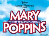
If you go look at a larger version of the poster, you can see a slight serif.
http://fc03.deviantart.net/fs71/i/2012/084/9/0/mary_poppins_on_broadway_2012_by_nixumb-d4tww2f.jpg
I think it's Penumbra Flare.
http://fc03.deviantart.net/fs71/i/2012/084/9/0/mary_poppins_on_broadway_2012_by_nixumb-d4tww2f.jpg
I think it's Penumbra Flare.
Fonte sugerida: Penumbra Flare (Já sugerida aqui)

din-1451-engschrift-alternate. Comma substituted for the apostrophe.
Fonte identificada: Din 1451 Engschrift Alternate
Ah, sneaky alternates hiding from me.

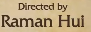
Agreed the cap P is Edwardian but I think the lowercase letters are Commercial Script
Fonte identificada: Commercial Script

'n' is an alternate
Todos os horários săo CEST. Agora săo 01:25
