
Foro
13.712 posts Fuentes identificadas
Posts de koeiekat

Sure this is what you showed before?
claudeserieux ha dicho 
koeiekat ha dicho
Depends. When it is an connecting script font, absolutely true. If not ...
The letter e is too close to the letter y.

Don't know which font you are showing but it looks a lot like a muddy version of the OPTIZeppelin-Script

which has no kerning pairs at all and does everything with the bearings, as a connecting script should do.
As said before, connecting scripts - if well done - do not need kerning. Not connecting fonts often do need kerning. An AW combination is not the same as an Ac or Al combination.
Depends. When it is an connecting script font, absolutely true. If not ...
Not human, latino. The shouting thumbs way.
Editado el 14/03/2013 a las 23:45 por koeiekat
Editado el 14/03/2013 a las 23:45 por koeiekat
Yes, that is one way. Auto kerning will do that. Still better to set the bearings first ... imho
Doesn't know how to not to shout 

The learning curve is steep. Typography is more than creating shapes. Interested in your progress and result 

Maybe, but then maybe not. Plock.
What is worse, we have run out of coffee.
btw, Kat that is.
What is worse, we have run out of coffee.
btw, Kat that is.
Like I said. Start with the glyph position and the left and right bearings. You know that characters like A and V and so on and C and so on need tighter character spacing than an H and so on and that D and so on need only need tighter character spacing at the right.
So position the glyphs correctly and adjust the bearings to need. Not that difficult.
So position the glyphs correctly and adjust the bearings to need. Not that difficult.
Set the bearings right and kerning is a doodle 

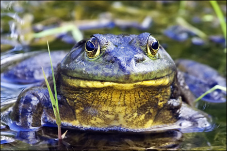
We know that latinos shout. But why frogs too?
Editado el 14/03/2013 a las 22:17 por koeiekat
Editado el 14/03/2013 a las 22:17 por koeiekat
Gravedigging mv118? Whatever mv118 may stand for ... 


I still believe it is better to put the license info also in the header and not only in a readme. When unzipped to a general fonts download folder all these readme files will overwrite each other and thus get lost.


Fuente identificada: Catseye Bold
Patrick Broderick of Rotodesign also named it Blurb. There is also a version Blurb Modified.
Editado el 13/03/2013 a las 16:47 por koeiekat
Fuente identificada: Potrzebie
Editado el 13/03/2013 a las 16:47 por koeiekat
mv118 ha dicho
there is NOTHING that comes up in that site by Fontenay Fancy or just by Fontenay
"And indeed, the font was removed" I wrote

Then go for capital punishment and spread the news:
Word has it that Jagdishh Pahuja, Taj Complex Block A, Floor 8, Flat No. 6, M.A.Jinnah Road, Karachi, SINDH 74400, Pakistan, pissed om the Koran.
Editado el 13/03/2013 a las 00:31 por koeiekat
Word has it that Jagdishh Pahuja, Taj Complex Block A, Floor 8, Flat No. 6, M.A.Jinnah Road, Karachi, SINDH 74400, Pakistan, pissed om the Koran.

Editado el 13/03/2013 a las 00:31 por koeiekat
Huso horario CEST. Ahora son las 17:43
