
Forum
13.114 posts Identifizierte Fonts Nur Anfragen
Posts von Heron2001


Identifizierter Font: Tire Shop


I think this was "eroded" by someone in photoshop. The basic font looks like Gobold to me.
Vorgeschlagener Font: Gobold

erasure around the J gets you there and then modifying the B using the new J and erasing little bits.
ONLY WITH LOTS OF MODIFICATION
ONLY WITH LOTS OF MODIFICATION
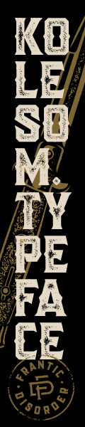
Identifizierter Font: Mariage

The scratch marks are after the fact.
Take a look at Proxima Nova in Black weight. And then picture it stroked to make it "Ultra"
Take a look at Proxima Nova in Black weight. And then picture it stroked to make it "Ultra"
Identifizierter Font: Proxima Nova

Identifizierter Font: Bernard

Identifizierter Font: Airstrike

Identifizierter Font: Lithos

O gostoso
Fira Sans Extra Condensed - in Medium Italic weight
Fira Sans Extra Condensed - in Medium Italic weight
Vorgeschlagener Font: Fira Sans Extra Condensed


Identifizierter Font: Rosewood
1Bryon sagte 
Whats the name of the main font?
You really should start your own thread. The main font looks like it was from Avant Garde and it's alternative letters - http://www.myfonts.com/fonts/itc/avant-garde-gothic/std-medium/glyphs.html then modified to look like a blueprint type.
Since the OP did not request this font, I am leaving you with the glyphs only.


Alle Zeitangaben sind CEST. Es ist jetzt 10:40
