
Forum
13.177 posts Identifizierte Fonts Nur Anfragen
Posts von Heron2001


Vorgeschlagener Font: Sarala

Vorgeschlagener Font: Heavitas

Alternatives glyphs, like the T, can be seen here: http://www.myfonts.com/fonts/emigre/mason-ot/serif-bold/glyphs.html
Identifizierter Font: Mason Serif Bold

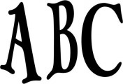
anjo - seems to be based on Times Roman - and the inside counter of the "A" has been angled...
Vorgeschlagener Font: Times


I'm not sure where they got the K from but the rest seems to be Olympic Branding
Identifizierter Font: Olympic Branding
Identifizierter Font: Another America
Vorgeschlagener Font: Giorgio Sans Black

I feel like someone took a font like Optima and created this. If you would like something similar, without the work, and in case no one finds this - try Dala Moa Light
Vorgeschlagener Font: Dala Moa Light

Identifizierter Font: Ageone

Feels like a Raleway kind of a morning....
PS NOT THE FONT - the C isn't it...
Bearbeitet am 28.02.2016 um 16:19 von Heron2001
PS NOT THE FONT - the C isn't it...
Vorgeschlagener Font: Raleway
Bearbeitet am 28.02.2016 um 16:19 von Heron2001


Identifizierter Font: Creative Block BB
Alle Zeitangaben sind CEST. Es ist jetzt 05:33
