Tipi
9.822 scaricati (1 ieri) Gratis per uso personale - 10 file dei caratteri
Tipi-Electric.otfTipi-SlantedElectric.otfTipi-ElectricInline.otfTipi-SlantedElectricInline.otfTipi-ElectricDisplay.otfTipi-SlantedElectricDisplay.otfTipi-Archaic.otfTipi-ArchaicInline.otfTipi-Organic.otfTipi-OrganicInline.otfNote dell'autore
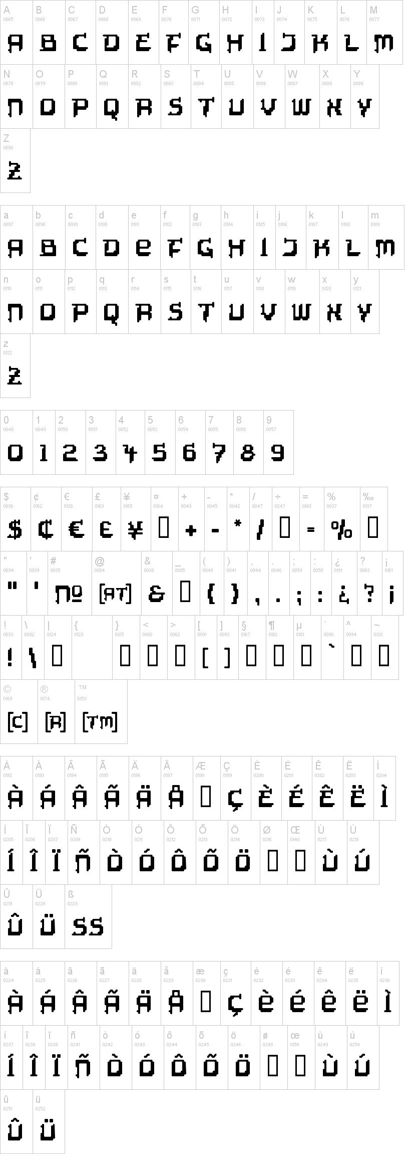
TIPI is my very early attempt to create a techno typeface by using a grid. But somehow the result called TIPI ELECTRIC didn't really look technoid, but had a rather decorative and ethnic appearance. This kind of paradox lead to the variations TIPI ARCHAIC & TIPI ORGANIC to take this impression a bit further. (The name TIPI is just a hint in the ethnical direction, while not explicit referring to north american natives and their tents. After all, it's just a pretty short name, that looks good to me set in this typeface.)
TIPI is using equal metrics from Plain to Inline and therefore can be used as a layer font, e.g. to give the inlines a different colour. (Exeption: TIPI ELECTRIC DISPLAY has no layerfunction.)
I designed TIPI in 1998. Actually, I had an ambivalent relation to the result and didn't even think of releasing it in any way. In consequence it disappeared in a long row of CD ROM backups which I reviewed recently because I realized that these old backups like to become unreadable over the years. So, what you get here is a type design shown to the world about 20 years after its creation … now, maybe someone has an idea where to apply such an unique typeface?
Thomas Mettendorf
www.schmalfett.de
Visto per la prima volta su DaFont: 01/07/2018