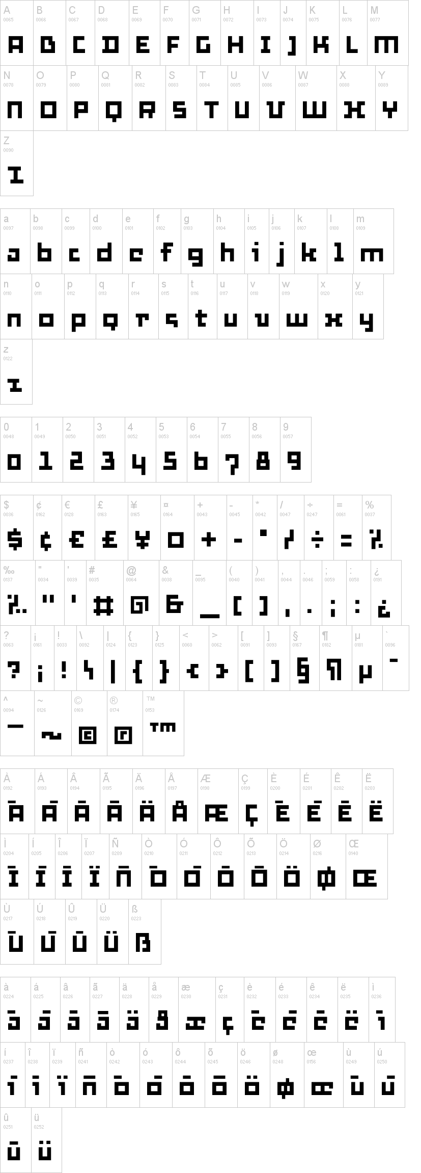
Thirtysix
9.315 scaricati (2 ieri) 100% Gratis
Thirtysix.ttfNote dell'autore
Constructed on a grid of 25/1000, or about six times more refined than the "six" font http://www.dafont.com/six.font. As the rhythm is 6 times weaker, there is 6 times more room for detail? "Proving" that character-timed rhythm can hardly be a factor of legibility.
Visto per la prima volta su DaFont: 03/12/2012