Pubblicità di Tudor Banciu
Hipstravaganza
Hipstravaganza di Tudor Banciu 
15.143 scaricati (1 ieri) Demo - 2 file dei caratteri
Hipstravaganza-Regular_Demo.otfNote dell'autore
THIS IS JUST A DEMO.
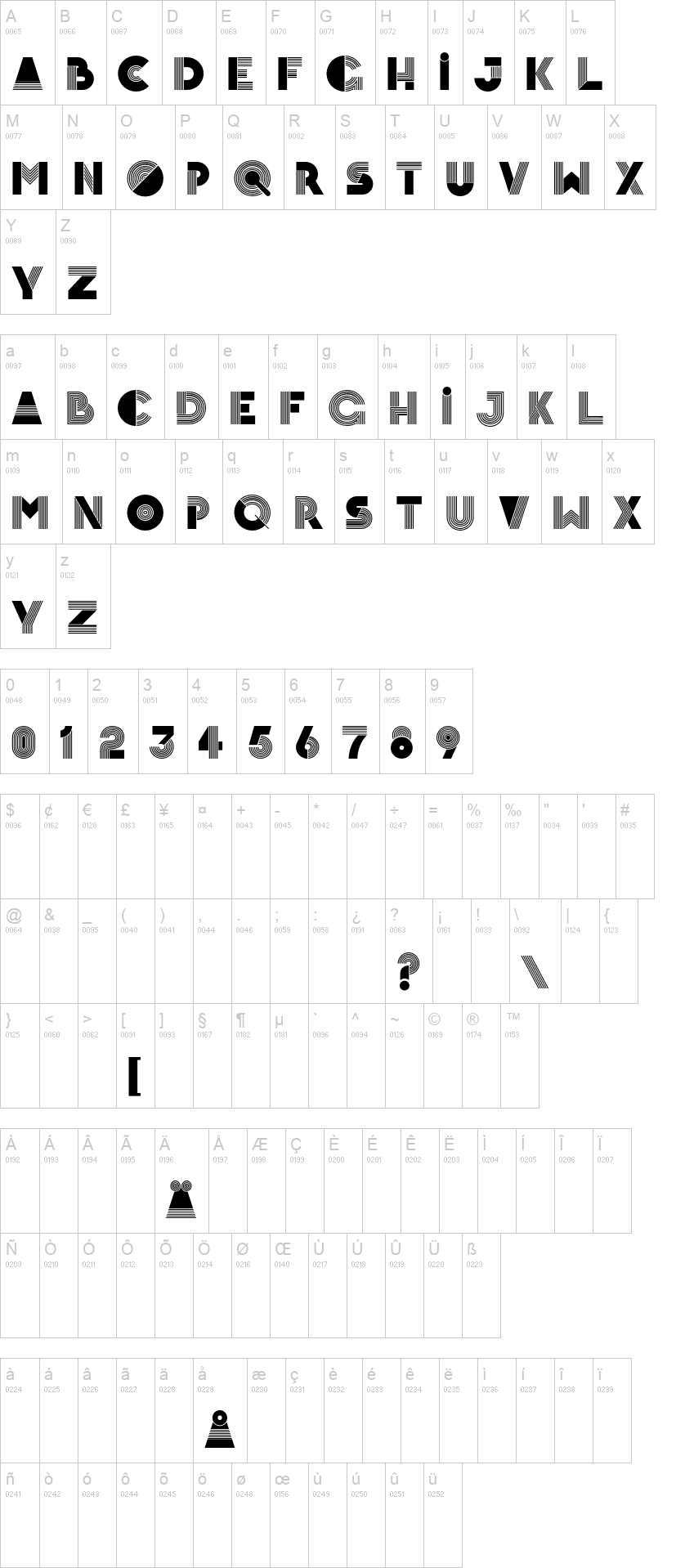
It is a variation on the Hipstravaganza Regular font, where all closed circles were "cut" so that the font works as a stencil - at least in theory. The original font was already lending itself very well to cutouts, save for 0, O, 9, 6 and a few dots and diacritics.
If you like it, and want to use it commercially, please buy it from http://www.fontspring.com/fonts/tudy1311/hipstravaganza?refby=tudy1311
***
This one is all about a flashy retro style. I wanted to create something with a bit more Ĺbangĺ. So I set out to make a mixture between blocks and parallel lines.
Because it is an all caps font, I decided to make the lowercase set into a second set of glyphs. They are similar to the caps, but with less blocks in the letters. I included all glyphs from LatPro, except for two ligatures.
It is pretty niche, and it works best as the centerpiece of a poster or as a foreground in front of photos. Due to itĺs complex shapes, itĺs a little difficult to pair up with too many other elements and fonts, but itĺs certainly an eye catcher!
In very small it creates moire, but also if seen from afar, the parallel lines create a sort of illusion of partial transparency.
Visto per la prima volta su DaFont: 11/11/2021 - Aggiornato: 20/09/2022